 Firefox

 1 / 3
Loading font…
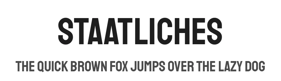
About Staatliches Font
Staatliches is a clean cut display face with charmingly unconventional proportions. The alphabet was designed in response to Herbert Bayer’s title lettering on the cover of the first Bauhaus exhibition catalogue , which was published in 1923. It features full sets of capitals, numbers, punctuation, and symbols, in addition to alternate widths, discretionary ligatures, and common Latin accents.
Style & Use Cases
- Overall Style
- Eye-catching, Bold, Display
- Use Case
- Headlines, Logos
- Ideal For
- posters, branding, and social media graphics
- Pairs With
- a readable sans or serif for body
Staatliches Specifications
| Font Family | Staatliches |
| Style | Regular |
| Full Name | Staatliches Regular |
| Version | 1.000 |
| Weight | 400 (Regular) |
| Glyph Count | 424 glyphs |
| PostScript Name | Staatliches-Regular |
| Designer | Brian LaRossa & Erica Carras |
| Format | TTF (TrueType) |
| File Size | 61.8 KB |
OpenType Features
Staatliches ships with 7 OpenType features you can switch on in apps that support them (Illustrator, InDesign, Affinity, Figma, CSS font-feature-settings).
- Case-sensitive forms
- Fractions
- Standard ligatures
- Ordinals
- Stylistic alternates
- Superscripts
- Slashed zero
Languages Supported
Staatliches supports 289 languages.
How to Install Staatliches Font
Step-by-step instructions for every platform
- 1Download the Staatliches font file (.ttf or .otf).
- 2Locate the downloaded file in your Downloads folder.
- 3Right-click the font file.
- 4Select "Install" to install for the current user, or "Install for all users" to make it available system-wide.
- 5Staatliches is now available in Word, Photoshop, Illustrator, and all other apps.
Browse fonts by theme
Curated collections →Saw a font in a picture? Identify any font from an image with our free Font Finder.
More Display Fonts
Browse all →
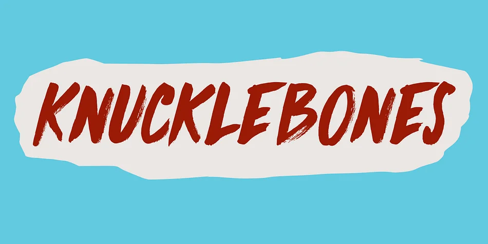
What pairs well with Staatliches Font?
Staatliches Font is a display font that shines as a display or heading face. Pair it with a clean sans-serif or serif font for body text — the contrast creates a clear hierarchy while the two styles stay balanced and easy to read.
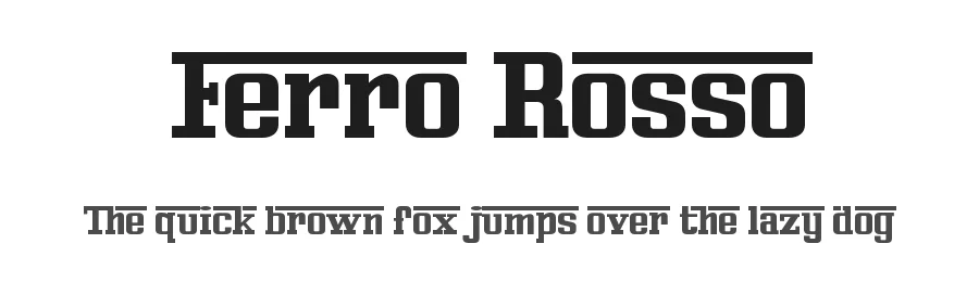
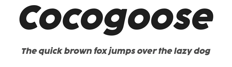
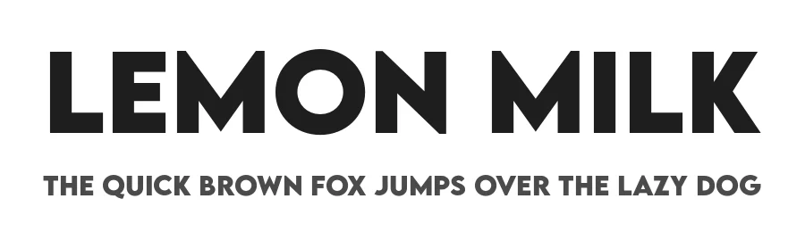

Premium Display Fonts
★ PremiumWant something with more weights, glyphs, and commercial polish? These premium display fonts are worth a look.
Staatliches Font
by Brian LaRossa, Erica Carras
Reviewed by the FontBoxDL team · Updated July 2026