 Firefox

About TWO CENTS PLAIN JNL Font
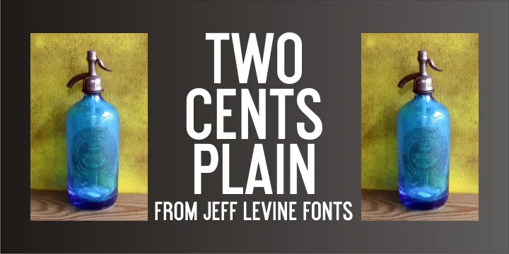
This typeface feels like stepping into a 1930s corner drugstore. Two Cents Plain JNL, designed by Jeff Levine Fonts, takes its name from Depression-era slang used across the Northeast, where resourceful people ordered plain seltzer water to save money instead of paying extra for syrup flavoring. Every penny mattered during those lean years, and that honest, unpretentious spirit is baked into this font's straightforward design. It doesn't try too hard, but it gets the job done with quiet dignity.
The clean sans-serif structure works beautifully across retro diner menus, vintage soda shop signage and branding, speakeasy bar interiors, and antique market posters. Large-scale display work, smaller nostalgic event invitations, and vintage-themed packaging labels all benefit from its authentic character. The simplicity carries genuine personality without pretension, making it especially useful for recreating mid-century Americana or Depression-era aesthetics in contemporary design. It balances plainness with charm in a way that feels honest.
Pair it with a warm serif for body text to balance the clean lines, or layer it with another geometric sans for stacked headlines and accents. Grab Two Cents Plain JNL from Creative Fabrica and bring authentic vintage energy to your projects.
Style & Use Cases
- Overall Style
- Eye-catching, Bold
- Use Case
- Headlines, Logos
- Ideal For
- posters, branding, and social media graphics
- Pairs With
- a readable sans or serif for body
How to Install TWO CENTS PLAIN JNL Font
Step-by-step instructions for every platform
- 1Download the TWO CENTS PLAIN JNL font file (.ttf or .otf).
- 2Locate the downloaded file in your Downloads folder.
- 3Right-click the font file.
- 4Select "Install" to install for the current user, or "Install for all users" to make it available system-wide.
- 5TWO CENTS PLAIN JNL is now available in Word, Photoshop, Illustrator, and all other apps.
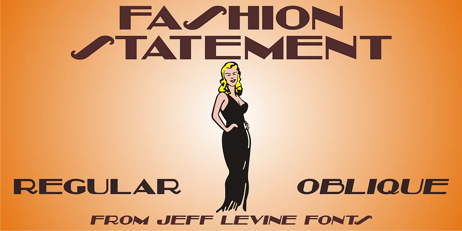
More by Jeff Levine Fonts
View all →
Browse fonts by theme
Curated collections →Saw a font in a picture? Identify any font from an image with our free Font Finder.
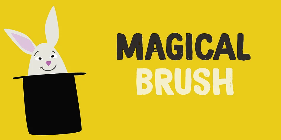
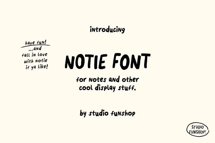
More Display Fonts
Browse all →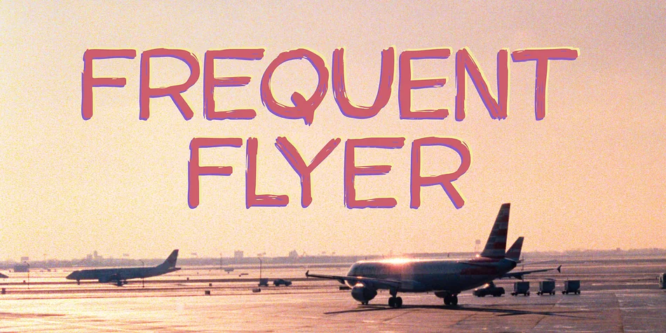
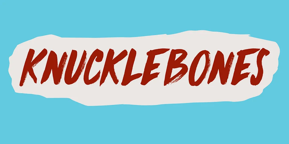
What pairs well with TWO CENTS PLAIN JNL Font?
TWO CENTS PLAIN JNL Font is a display font that shines as a display or heading face. Pair it with a clean sans-serif or serif font for body text — the contrast creates a clear hierarchy while the two styles stay balanced and easy to read.
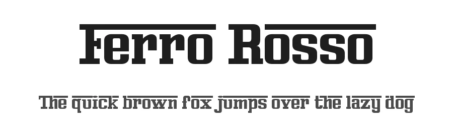
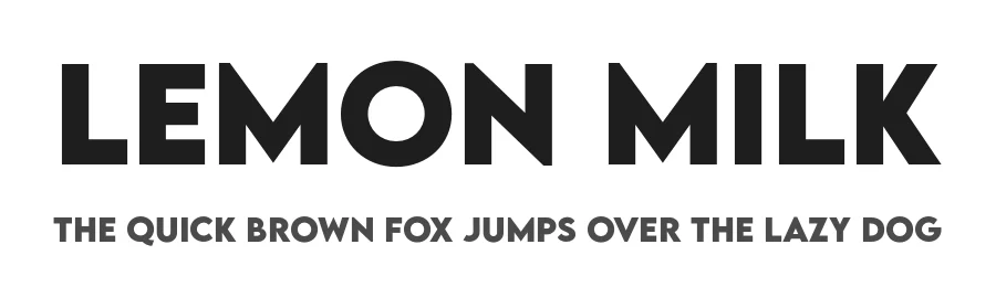
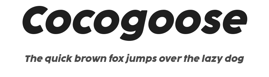

TWO CENTS PLAIN JNL Font
Reviewed by the FontBoxDL team · Updated September 2026