 Firefox
 1 / 5
1 / 5About Structural Steel JNL Font
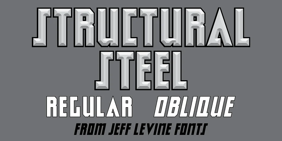
An ad in the March 27, 1961 issue of Boxoffice Magazine for the film “Atlantis-The Lost Continent” featured the film’s title hand lettered in an ultra bold, block-like sans design.
With some letters squared, and some chamfered at the corners, this typeface evokes strength and durability. It is available digitally as Structural Steel JNL in both regular and oblique versions.
Style & Use Cases
- Overall Style
- Eye-catching, Bold
- Use Case
- Headlines, Logos
- Ideal For
- posters, branding, and social media graphics
- Pairs With
- a readable sans or serif for body
How to Install Structural Steel JNL Font
Step-by-step instructions for every platform
- 1Download the Structural Steel JNL font file (.ttf or .otf).
- 2Locate the downloaded file in your Downloads folder.
- 3Right-click the font file.
- 4Select "Install" to install for the current user, or "Install for all users" to make it available system-wide.
- 5Structural Steel JNL is now available in Word, Photoshop, Illustrator, and all other apps.
More by Jeff Levine Fonts
View all →
Browse fonts by theme
Curated collections →Saw a font in a picture? Identify any font from an image with our free Font Finder.
More Display Fonts
Browse all →
What pairs well with Structural Steel JNL Font?
Structural Steel JNL Font is a display font that shines as a display or heading face. Pair it with a clean sans-serif or serif font for body text — the contrast creates a clear hierarchy while the two styles stay balanced and easy to read.

Structural Steel JNL Font
Reviewed by the FontBoxDL team · Updated April 2026