 Firefox
 1 / 5
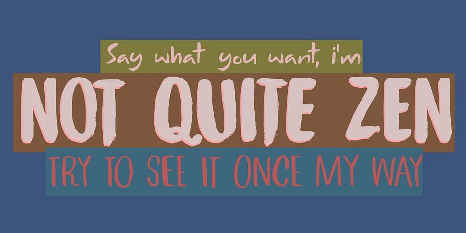
1 / 5About Not Quite Zen Font
Picture yourself laying out cover art for an indie rock album or designing a striking music blog masthead that actually stops the scroll. Not Quite Zen by Kitchen Table Type Foundry brings exactly that kind of energy to the screen. This display family pulls from 90s rock sensibility without overselling it, which is the whole idea: three complementary fonts (two brush variations plus a script, complete with italics) that play together as naturally as bandmates with genuine chemistry.
Use the brush weights for attention-grabbing headlines on concert posters or festival graphics. The script version works beautifully as a secondary accent for song titles, liner notes, or vintage record label branding. You'll also find it earns its place on band merchandise designs, album packaging, and artist portfolio sites where personality matters more than restraint. At larger display sizes, the typefaces read with warmth and movement without ever sacrificing legibility or impact.
Since the family comes as a unified system, you can combine the brush and script styles across different projects without searching elsewhere for complementary typefaces. The matching italics give you extra flexibility for hierarchies and emphasis. Grab it on Creative Fabrica and watch these energetic fonts bring presence to your album art and band designs.
Style & Use Cases
- Overall Style
- Eye-catching, Bold
- Use Case
- Headlines, Logos
- Ideal For
- posters, branding, and social media graphics
- Pairs With
- a readable sans or serif for body
How to Install Not Quite Zen Font
Step-by-step instructions for every platform
- 1Download the Not Quite Zen font file (.ttf or .otf).
- 2Locate the downloaded file in your Downloads folder.
- 3Right-click the font file.
- 4Select "Install" to install for the current user, or "Install for all users" to make it available system-wide.
- 5Not Quite Zen is now available in Word, Photoshop, Illustrator, and all other apps.
More by Kitchen Table Type Foundry
View all →
Browse fonts by theme
Curated collections →Saw a font in a picture? Identify any font from an image with our free Font Finder.
More Display Fonts
Browse all →







What pairs well with Not Quite Zen Font?
Not Quite Zen Font is a display font that shines as a display or heading face. Pair it with a clean sans-serif or serif font for body text — the contrast creates a clear hierarchy while the two styles stay balanced and easy to read.



Not Quite Zen Font
Reviewed by the FontBoxDL team · Updated June 2026