 Firefox
 1 / 8
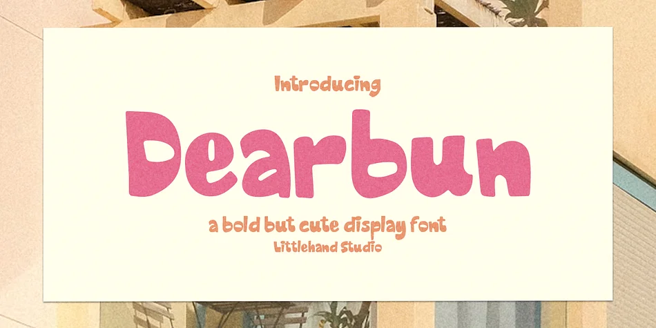
1 / 8About Dearbun Font
Dearbun's chunky, rounded letterforms pack the inviting thickness you'd find in quality brush lettering, designed by Littlehand. The individual shapes feel genuinely handcrafted, with curves that land soft and geometry that still commands attention when you go bold. This is a display font purpose-built for work that needs real warmth without sacrificing any presence or punch.
You'll see it work beautifully on artisan product labels, greeting card suites, children's book cover typography, and social media stickers where personality counts. The complete character set covers uppercase and lowercase letters, full numerals and punctuation, plus alternates and ligatures to add visual variation where you need it most. Multilingual support is baked in, which means character range won't limit the scope of your projects.
It's built for any branding or design work that leans toward approachable and friendly rather than corporate or sterile. Designers creating identity systems for indie makers, DIY craft signage, packaging that reads as handmade, or playful event graphics will find a real partner in these forms. The soft yet chunky weight strikes a balance most display fonts miss entirely. Get it on Creative Fabrica and start bringing this kind of genuine warmth to your next project.
Style & Use Cases
- Overall Style
- Eye-catching, Bold
- Use Case
- Headlines, Logos
- Ideal For
- posters, branding, and social media graphics
- Pairs With
- a readable sans or serif for body
How to Install Dearbun Font
Step-by-step instructions for every platform
- 1Download the Dearbun font file (.ttf or .otf).
- 2Locate the downloaded file in your Downloads folder.
- 3Right-click the font file.
- 4Select "Install" to install for the current user, or "Install for all users" to make it available system-wide.
- 5Dearbun is now available in Word, Photoshop, Illustrator, and all other apps.
More by Littlehand
View all →
Browse fonts by theme
Curated collections →Saw a font in a picture? Identify any font from an image with our free Font Finder.
More Display Fonts
Browse all →
What pairs well with Dearbun Font?
Dearbun Font is a display font that shines as a display or heading face. Pair it with a clean sans-serif or serif font for body text — the contrast creates a clear hierarchy while the two styles stay balanced and easy to read.



Dearbun Font
by Littlehand
Reviewed by the FontBoxDL team · Updated September 2026