 Firefox

 1 / 3
Loading font…
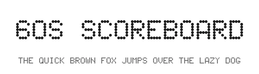
About 60s Scoreboard Font
60s Scoreboard is a recreation of the dot-matrix scoreboard displays of many sports stadiums past. This font was originally created on Fontstruct.com (original URL:
http://fontstruct.com/fontstructions/show/343207/
).
This font is free to download and use for personal, non-commercial purposes. If you enjoy this font and see yourself using it on a regular basis, please consider a donation of at least US$5 to
[email protected]
(or simply click on
https://www.paypal.me/JohnIsles/5
to simplify the process).
For commercial usage of this font -- including, but not limited to, usage in advertisements (TV, print, and/or web), broadcasts (TV and/or web), professional printing, software, et. al. -- please contact me at
[email protected]
first before donating.
60s Scoreboard is (c) 2010-16 John H. Isles, iv and Creative Commons Attribution Non-commercial No Derivatives license
(http://creativecommons.org/licenses/by-nc-nd/3.0/). This license is subject to modifications without any prior notice.
Style & Use Cases
- Overall Style
- Eye-catching, Bold, Techno
- Use Case
- Headlines, Logos
- Ideal For
- posters, branding, and social media graphics
- Pairs With
- a readable sans or serif for body
How to Install 60s Scoreboard Font
Step-by-step instructions for every platform
- 1Download the 60s Scoreboard font file (.ttf or .otf).
- 2Locate the downloaded file in your Downloads folder.
- 3Right-click the font file.
- 4Select "Install" to install for the current user, or "Install for all users" to make it available system-wide.
- 560s Scoreboard is now available in Word, Photoshop, Illustrator, and all other apps.
Browse fonts by theme
Curated collections →Saw a font in a picture? Identify any font from an image with our free Font Finder.
More Display Fonts
Browse all →
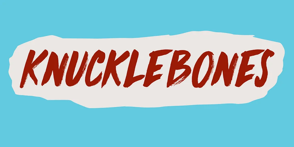
What pairs well with 60s Scoreboard Font?
60s Scoreboard Font is a display font that shines as a display or heading face. Pair it with a clean sans-serif or serif font for body text — the contrast creates a clear hierarchy while the two styles stay balanced and easy to read.
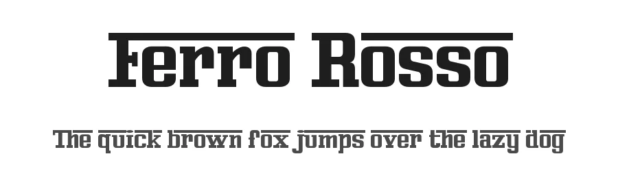
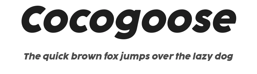
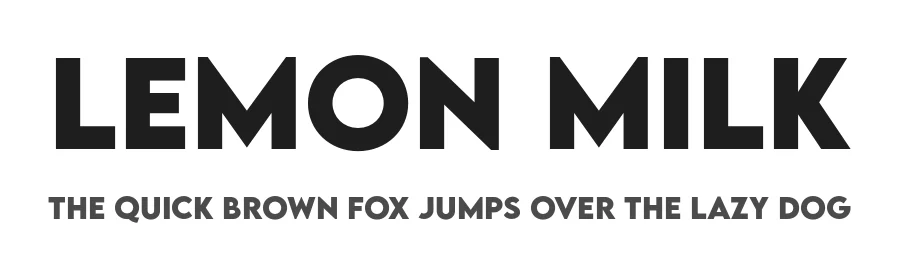

Premium Display Fonts
★ PremiumWant something with more weights, glyphs, and commercial polish? These premium display fonts are worth a look.
60s Scoreboard Font
by John Isles
Reviewed by the FontBoxDL team · Updated October 2026
License: Donationware