 Firefox
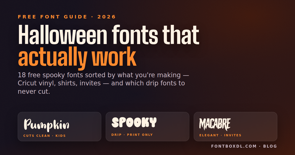
Every October I watch the same thing happen in the Etsy seller forums: someone grabs the drippiest blood font they can find, cuts a Trick or Treat shirt in black HTV, and then spends forty minutes weeding droplets the size of a grain of rice. Half of them lift off with the carrier sheet. Free Halloween fonts are the worst offenders for this, because the whole genre is built on texture — drips, cracks, splatters, scratches — and texture is exactly what a fine-point blade hates. So this isn't a pretty-pictures list. It's sorted by what you're actually making — vinyl, shirts, invites each want a different kind of spooky — and I've tried to be honest about which fonts fall apart where.
The four checks before you download anything
- Type your real phrase. Not the alphabet — a font with gorgeous capitals can have lowercase letters that collapse into a blob.
- Look at the smallest text at its real size. A two-inch mug decal is where drips and cracks go to die.
- Decide whether you're cutting or printing. Print (sublimation, DTF, a home inkjet for invites) handles any texture you throw at it. Cutting needs clean, closed, reasonably thick shapes.
- One spooky font per project. Use the horror face for the hero word only — BOO, the party name, the kid's name — and set the date, time and address in a plain sans or a quiet face like Pumkins Halloween or The Macabre. Two horror fonts on one piece fight each other and neither reads.
I preview phrases in the font generator before I download anything, and it has saved me from more than one dud.
Free Halloween fonts that cut clean on a Cricut
Horrorcore is my default for a one-word shirt: BOO, HAUNTED, a kid's name across the chest. The strokes are thick with no hairline joins, so at a three-inch cap height it weeds in one pull. The trap is the counters — the holes in O, A and R are tight, so at small decal sizes they close up and the word reads as a black bar.
Stencil Gothic is what I hand to anyone spray-painting pumpkins or making a porch sign. It's a real stencil font, so every letter already has bridges and the middle of the O doesn't fall out when you cut cardstock or stencil vinyl. The blackletter shapes carry the gothic mood without a single drip. It reads formal rather than scary — wrong for a kids' party, perfect for a Welcome, Mortals board. Test the word October before you commit, though: the stencilled lowercase c and o read almost identically at a glance.
Timemachine Halloween is the retro-70s look that's all over shirts and totes this year: chunky, rounded, no drips, the kind of groovy lettering that says Halloween without saying horror. It cuts well because the strokes are even and the edges are smooth. The trap is tight all-caps stacking — crowd the lines together and the counters close, so give it breathing room.
Western Nightmare is a slab serif with a horror edge, and slab serifs are a gift to vinyl: wide, flat, no thin joins. I put it on a Haunted Ranch tote and the serifs came off the mat without a single tear. It gets busy in full sentences, so keep it to two or three words.
Dr. Bones builds each letter out of bone shapes, and it's one of the few novelty fonts that still cuts well because every bone is a chunky closed shape. Great for party banners and treat-bag tags. Where it fails is readability: lowercase is hard to parse, so set it in caps, and don't go too small or the knobs on the bone ends disappear.
Drip fonts: print them, don't cut them
This is the category that burns people. Drips are the Halloween look, and they're also the one thing a blade can't handle at small sizes: a drip tapers to a point, and the point either tears or never releases from the backing.
Bloodsoul is the best-looking drip font in the collection, and on an 18-by-24 poster or a sublimation shirt it's genuinely good. For cutting, each letter carries several drips that taper to nothing; at poster-size caps they're borderline, and at shirt size they're confetti.
Bloody Hell is chunkier with fewer drips, which makes it the one drip font I'd actually try in HTV at shirt size. The letterforms underneath are plain sans, so it's also easier to read than Bloodsoul. It also holds up as Instagram story text.
Halloween Nightmare has long, wavy drips that hang well below the baseline, so two-line layouts collide. Use it for a single line on a printed invitation header or a digital flyer. Cutting it is a hobby in itself.
Textured and distressed fonts for sublimation and DTF
Horror Brush looks like a dry brush dragged through paint, and that ragged edge is hundreds of tiny vector points. On a DTF transfer or a sublimated shirt it's the best handmade Halloween look on this list. In vinyl, every bristle mark is a sliver to weed. I tried it once. Never again.
Horror Korpus is distressed in a more controlled way — the letters are intact, just eroded at the edges — so it prints beautifully on kraft-paper invitations and still reads at body-text size. It's my pick for an adult party where scary needs to stay a little classy.
Spooky Stone has a carved-rock texture inside each letter that only survives at print resolution. It's right for a gravestone-style yard sign printed on coroplast, and it is not a cutting font in any universe.
Cute, kid-friendly fonts that actually read
Pumpkin Story is rounded, friendly and bold, the kind of font that sells on a My First Halloween bodysuit. It cuts like a dream because there is nothing thin on it. The only trap is that it's a bit generic, so pair it with a spookier accent font for the headline word.
Pumkins Halloween is softer, with a slightly wobbly baseline that gives it personality. I use it for the body text on kids' party invites — date, time, address — because it stays legible at small sizes when most Halloween fonts don't.
Ghosty has soft, puffy letters that look like they're floating. It suits mugs and nursery decor and cuts fine. The lowercase g and y have thin tails that lift on glossy vinyl, so stick to caps for small decals.
Witchwoode is crooked and whimsical, the font equivalent of a leaning haunted house. It's great for Etsy wood signs in permanent vinyl, because the crookedness hides small alignment wobbles. Letter heights vary a lot, so leave extra vertical margin in your layout.
Scripts and elegant faces for invitations
The Macabre is an elegant gothic serif, and if you're printing a grown-up Halloween dinner invitation this is the one. It has real lowercase, real punctuation, and it reads as a block of text, which almost nothing else here does. Don't bother cutting it small; the fine serifs go first.
Scary October is a handwritten spooky script with a slightly shaky hand, ideal for a guest's name on an envelope or the You're Invited line. In Design Space, weld the word so overlapping letters become one shape; otherwise you get tiny slivers wherever letters cross.
Young Blood Script is a brush script with enough weight for a shirt — the witch, please genre of Halloween tee. The connecting strokes are the thin part, so cut it wide, a full chest width rather than a pocket, or the joins snap while weeding.
How to actually use these
Download the font, unzip it, double-click the TTF or OTF and hit Install. Restart Design Space (or Silhouette Studio, or Canva desktop) and it shows up under System Fonts. In Canva itself, custom fonts upload under Brand Kit, and that needs Canva Pro. Free and demo versions often ship without numbers or punctuation, so type Oct 31, 7 PM before you build an invite around one. For anything you'll cut: type the phrase, set it to the real finished size, then zoom in on the thinnest stroke. If anything is narrower than about a sixteenth of an inch, go bigger or pick another font. Weld scripts, attach multi-line layouts, mirror HTV. For printing: export at 300 dpi and set textured fonts in one dark color, because gradients on a distressed face just muddy the texture. And check the license before you sell anything — many Halloween display fonts are free for personal use only.
More Halloween fonts
These are the ones I keep coming back to, but the full Halloween fonts collection has far more, and the spooky fonts collection leans toward year-round horror rather than October. For the formal end of things the gothic fonts are worth a look, and if your project runs through Thanksgiving the fall fonts cover pumpkins without the ghosts. If you've spotted a Halloween font on a store shirt and can't name it, the font finder usually gets close from a photo.
FAQ
What is the best free Halloween font for Cricut?
For vinyl and HTV, Horrorcore and Stencil Gothic are the safest picks: thick strokes, no drips, nothing to weed except the counters. Pumpkin Story is the best cuttable option for kids' projects. Avoid drip and brush fonts unless you're cutting at poster size.
Can I use free Halloween fonts on products I sell on Etsy?
Only if the license allows commercial use. A lot of free Halloween display fonts are free for personal use, which means you can make your own shirt but not sell one. Check the license on each font's page and look for an open license or a commercial option before you list a product.
Why won't my Halloween font cut cleanly on my Cricut?
Usually because the drips or brush marks taper to a point, and a fine-point blade can't release shapes narrower than about a sixteenth of an inch; they tear or stay stuck to the backing. Cut larger, choose a chunkier font like Bloody Hell or Horrorcore, or print the design instead of cutting it.