 Firefox
 1 / 10
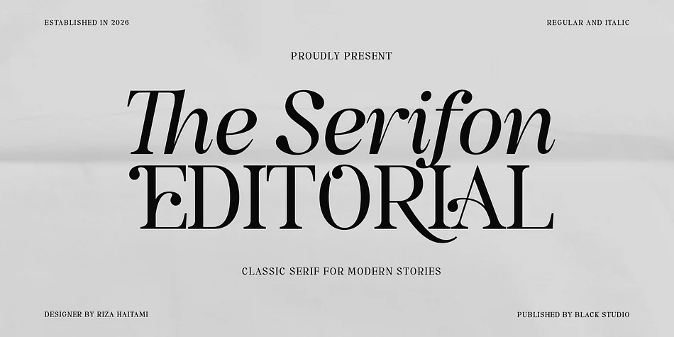
About The Serifon Editorial Font
You're laying out a luxury quarterly with demanding editorial standards, searching for a typeface that bridges tradition and modernity. The Serifon Editorial from Black Studio fits the brief perfectly. This high-contrast serif brings the authority of classic print forward while maintaining unmistakably contemporary character. The overall feel is refined without being precious.
Luxury magazine feature spreads benefit from its refined letterforms, which command attention on opening pages without sacrificing legibility even in dense layouts. Book jacket designers appreciate how graceful the serifs feel at large display sizes, adding weight without harshness. Heritage brand identity systems and curated fashion lookbooks work beautifully with this typeface's inherent sophistication. You get both Regular and Italic styles, with Extended Latin support for editorial projects across European markets.
The real strength lies in the technical foundation. OpenType features give genuine control: ligatures and contextual alternates add typographic texture to headlines, stylistic sets let you adapt the letterforms across different design contexts, and small caps handle subheadings and folios cleanly. The balanced x-height and expressive curves ensure the type reads as authoritative rather than decorative. Grab The Serifon Editorial from Creative Fabrica and add a serif with genuine editorial credibility to your toolkit.
Style & Use Cases
- Overall Style
- Eye-catching, Bold
- Use Case
- Headlines, Logos
- Ideal For
- posters, branding, and social media graphics
- Pairs With
- a readable sans or serif for body
How to Install The Serifon Editorial Font
Step-by-step instructions for every platform
- 1Download the The Serifon Editorial font file (.ttf or .otf).
- 2Locate the downloaded file in your Downloads folder.
- 3Right-click the font file.
- 4Select "Install" to install for the current user, or "Install for all users" to make it available system-wide.
- 5The Serifon Editorial is now available in Word, Photoshop, Illustrator, and all other apps.
More by Black Studio
View all →
Browse fonts by theme
Curated collections →Saw a font in a picture? Identify any font from an image with our free Font Finder.
More Display Fonts
Browse all →
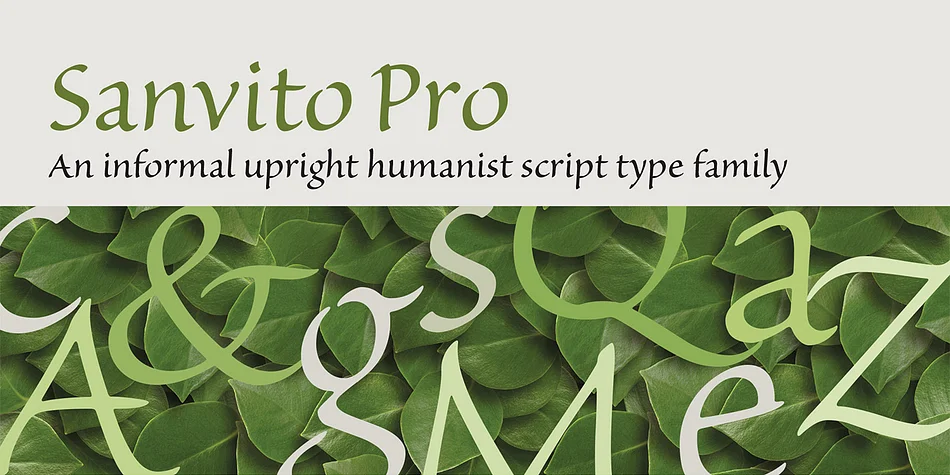
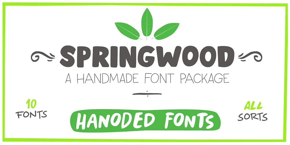
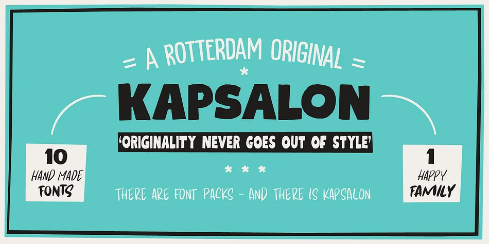
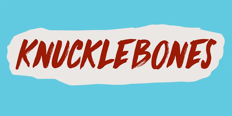
What pairs well with The Serifon Editorial Font?
The Serifon Editorial Font is a display font that shines as a display or heading face. Pair it with a clean sans-serif or serif font for body text — the contrast creates a clear hierarchy while the two styles stay balanced and easy to read.



The Serifon Editorial Font
by Black Studio
Reviewed by the FontBoxDL team · Updated September 2026