
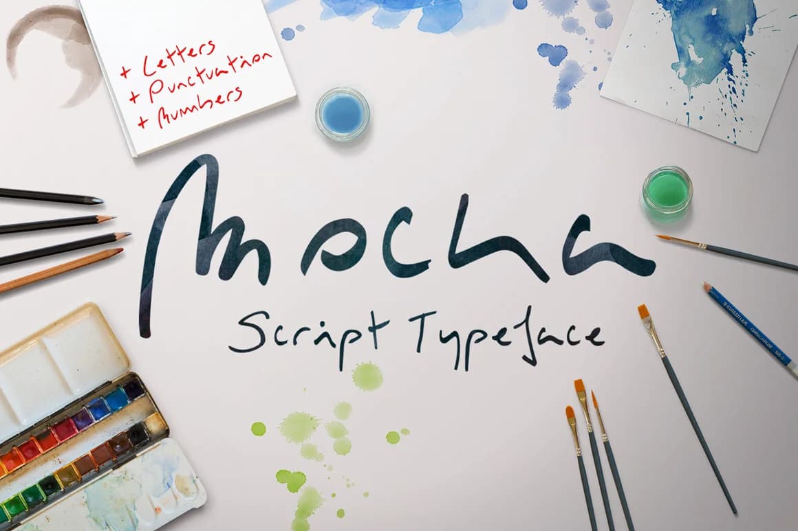
 1 / 6
1 / 6About Mocka Font
Mocka Font by SmartDesigns is a fluid script typeface that captures the warmth of natural handwriting without sacrificing readability or refinement. The letterforms flow with organic grace, each curve and stroke reflecting the designer's careful attention to authentic penmanship and letterform proportion. This handcrafted aesthetic feels both contemporary and timeless, equally at home in minimalist designs and ornate, layered compositions where personality matters.
Available in Bold, Light, and Ultralight weights, Mocka adapts across different design scales, moods, and communicative needs. Designers rely on it for personalized wedding stationery that sets an elegant, memorable tone; boutique packaging labels that emphasize artisanal quality and care; custom clothing tags for handmade fashion brands; and illustrated social media graphics that command attention in feeds saturated with sans-serif typefaces. The variable weights give you precise control over visual hierarchy while the script maintains its signature warmth and character across all sizes.
Whether you're a freelancer developing a distinctive design voice or a small business building strong brand consistency, Mocka brings sophistication and humanity to handcrafted work. Its natural letterforms work beautifully across both print and digital applications, making it a versatile addition to any designer's toolkit. Get Mocka Font on Creative Fabrica and bring this expressive script to your next project.
Style & Use Cases
- Overall Style
- Elegant, Flowing, Mocka
- Use Case
- Invitations, Branding
- Ideal For
- wedding stationery, greeting cards, and signatures
- Pairs With
- a simple uppercase sans
How to Install Mocka Font Font
Step-by-step instructions for every platform
- 1Download the Mocka Font font file (.ttf or .otf).
- 2Locate the downloaded file in your Downloads folder.
- 3Right-click the font file.
- 4Select "Install" to install for the current user, or "Install for all users" to make it available system-wide.
- 5Mocka Font is now available in Word, Photoshop, Illustrator, and all other apps.
More by SmartDesigns
View all →
More Script Handwritten Fonts
Browse all →







What pairs well with Mocka Font?
Mocka Font is a script font that shines as a display or heading face. Pair it with a clean sans-serif or serif font for body text — the contrast creates a clear hierarchy while the two styles stay balanced and easy to read.



Mocka Font
by SmartDesigns
Reviewed by the FontBoxDL team · Updated May 2026