 Firefox
 1 / 5
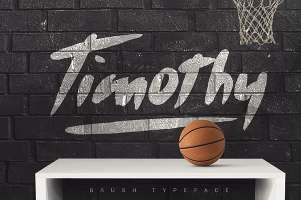
1 / 5About Timothy Font
Timothy Font by SmartDesigns is a handwritten script typeface featuring both bold and light weights, delivering expressive personality without sacrificing practical readability. The flowing letterforms showcase the kind of organic rhythm that works particularly well in branding applications where a human touch can make a genuine difference. This script thrives in projects like custom wedding stationery suites, artisanal product label design, vintage-inspired event posters, and boutique packaging systems. The natural curves also suit hand-drawn social media content and brand identity work for creative studios and independent makers seeking authenticity. The dual weights provide flexibility, use the bold version to anchor headlines while the lighter weight maintains legibility in smaller text blocks and supporting elements. Whether you're designing invitations with intricate detail or building a cohesive brand visual system, the letterforms respond well to varied sizing and applications. The typeface integrates seamlessly with Adobe Illustrator, Photoshop, Canva, and vector cutting software, making it accessible for both digital design workflows and physical production needs. The character set supports standard design work across these platforms. Bring Timothy Font into your project library from Creative Fabrica and discover how this script can add genuine character to your next design.
Style & Use Cases
- Overall Style
- Elegant, Flowing, Timothy
- Use Case
- Invitations, Branding
- Ideal For
- wedding stationery, greeting cards, and signatures
- Pairs With
- a simple uppercase sans
How to Install Timothy Font Font
Step-by-step instructions for every platform
- 1Download the Timothy Font font file (.ttf or .otf).
- 2Locate the downloaded file in your Downloads folder.
- 3Right-click the font file.
- 4Select "Install" to install for the current user, or "Install for all users" to make it available system-wide.
- 5Timothy Font is now available in Word, Photoshop, Illustrator, and all other apps.
More by SmartDesigns
View all →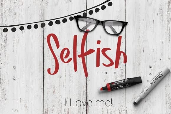

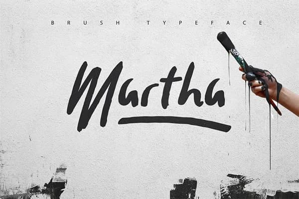
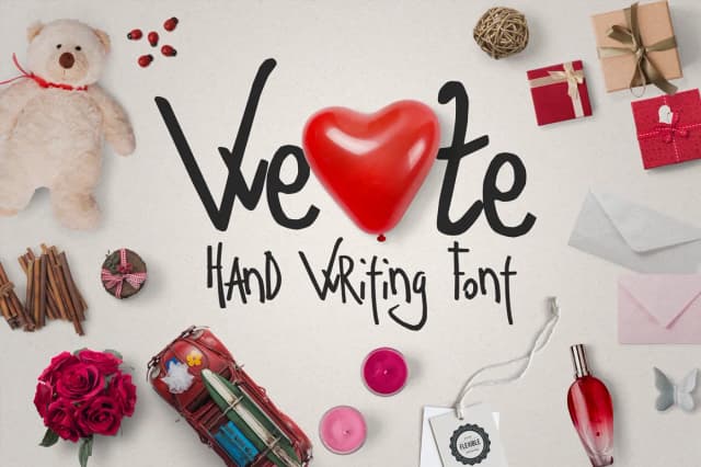
Browse fonts by theme
Curated collections →Saw a font in a picture? Identify any font from an image with our free Font Finder.
More Script Handwritten Fonts
Browse all →







What pairs well with Timothy Font?
Timothy Font is a script font that shines as a display or heading face. Pair it with a clean sans-serif or serif font for body text — the contrast creates a clear hierarchy while the two styles stay balanced and easy to read.



Timothy Font
by SmartDesigns
Reviewed by the FontBoxDL team · Updated May 2026