 Firefox
About MECHANIZED JNL Font
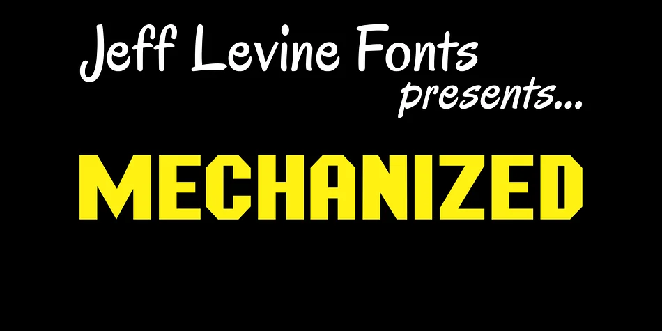
Picture a 1920s factory sign being redesigned for a modern speakeasy, or a vintage band poster coming to life for a steampunk festival. That's where MECHANIZED JNL by Jeff Levine Fonts finds its home. This display typeface carries the sturdy, geometric character of industrial lettering, mixing nostalgic engineering aesthetics with real personality. It's built for impact.
The font works particularly well for retro automotive branding, vintage vinyl record sleeve designs, steampunk-themed wedding invitations, and DIY mechanical engineering signage. Its bold, angular structure reads clearly even at large display sizes, making it ideal for posters and signage that demand immediate attention. Each letterform has that intentional, methodical feel that comes from mechanical drafting. Whether you're setting a single word large or running full headlines, the typeface carries its own confident authority.
On the technical side, it handles both all caps and mixed-case typography with equal confidence. Its character set covers standard English-language work well, and the font pairs naturally with simpler sans-serif faces or ornamental accents if you're layering styles in a complex layout. Size reveals the font's real strength, where every angle and curve reads with unmistakable intention. Grab MECHANIZED JNL on Creative Fabrica and bring that vintage-industrial character to your next project.
Style & Use Cases
- Overall Style
- Eye-catching, Bold
- Use Case
- Headlines, Logos
- Ideal For
- posters, branding, and social media graphics
- Pairs With
- a readable sans or serif for body
How to Install MECHANIZED JNL Font
Step-by-step instructions for every platform
- 1Download the MECHANIZED JNL font file (.ttf or .otf).
- 2Locate the downloaded file in your Downloads folder.
- 3Right-click the font file.
- 4Select "Install" to install for the current user, or "Install for all users" to make it available system-wide.
- 5MECHANIZED JNL is now available in Word, Photoshop, Illustrator, and all other apps.
More by Jeff Levine Fonts
View all →
Browse fonts by theme
Curated collections →Saw a font in a picture? Identify any font from an image with our free Font Finder.
More Display Fonts
Browse all →
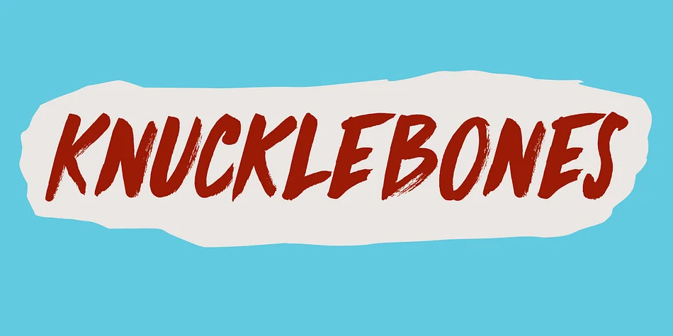
What pairs well with MECHANIZED JNL Font?
MECHANIZED JNL Font is a display font that shines as a display or heading face. Pair it with a clean sans-serif or serif font for body text — the contrast creates a clear hierarchy while the two styles stay balanced and easy to read.
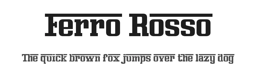
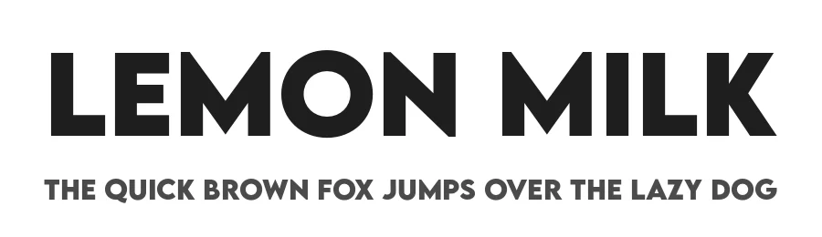
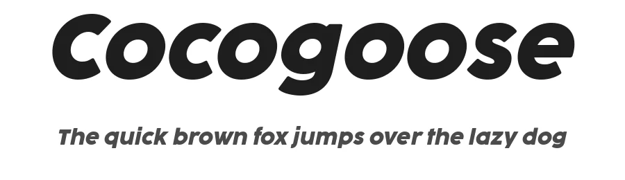

MECHANIZED JNL Font
Reviewed by the FontBoxDL team · Updated May 2026