 Firefox
 1 / 10
About Matahari Sans Font
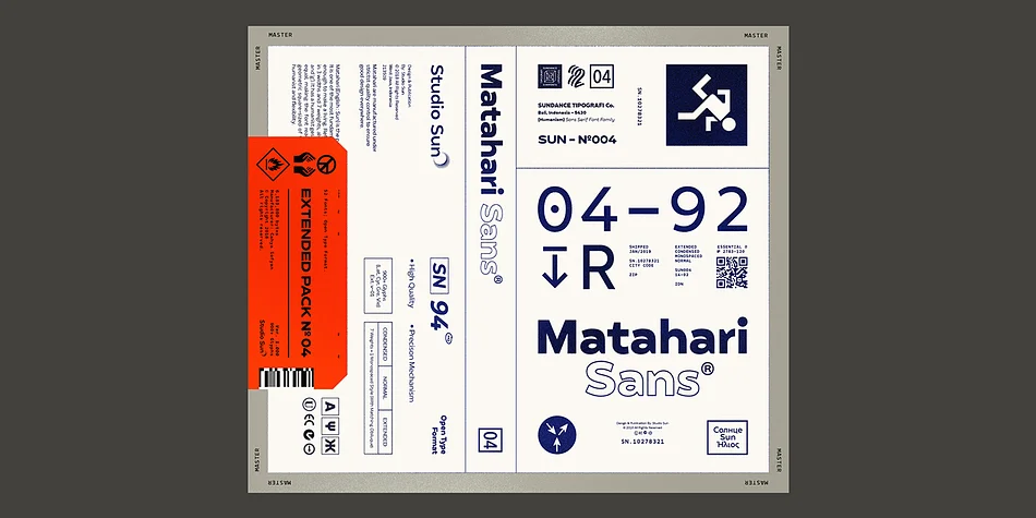
Matahari (English: Sun) is the power source of life. The symbol of power and energy that synergies with other part of daily lives. It is one of the most fundamental thing us humans need, just like communication. And like Matahari itself, words are powerful enough to make a living.
Referring to Grotesque Font and influenced by the works of Eric Gill, Matahari Typeface is available in 3 widths and 7 weights, also in Oblique version in each font. The font uses oldstyle and transitional letters (double-story ‘a’ and ‘g’). It has a humanist gesture, the thickness of the font is semi-monolinear where the horizontal and vertical size is almost equal, making the font reach its maximum optical readability even in small sizes. The font anatomy refers to the basic geometric square-sized of the letter ‘M’, while the letters of S/C/G/c/e have uneven curve shape which give the sense of humanist and flexibility.
This typeface is ideal for various design needs, from Printing to On-Screen/Digital Reading, from Brand Identity, Posters, Caption, Headline, to Body Text. With the numbers of widths available, the font can be used for all kinds of purposes (Label, Signage, Packaging, Website, etc). Supported well over 75+ languages, including Greek & Cyrillic, Matahari Typeface will give you an excellent way in aesthetic communication and message-delivering.
Style & Use Cases
- Overall Style
- Bold, Distinctive
- Use Case
- Headlines, Posters
- Ideal For
- logos, packaging, and standout titles
- Pairs With
- a neutral sans-serif
How to Install Matahari Sans Font
Step-by-step instructions for every platform
- 1Download the Matahari Sans font file (.ttf or .otf).
- 2Locate the downloaded file in your Downloads folder.
- 3Right-click the font file.
- 4Select "Install" to install for the current user, or "Install for all users" to make it available system-wide.
- 5Matahari Sans is now available in Word, Photoshop, Illustrator, and all other apps.
More by Studio Sun
View all →
Browse fonts by theme
Curated collections →Saw a font in a picture? Identify any font from an image with our free Font Finder.
More Decorative Fonts
Browse all →
What pairs well with Matahari Sans Font?
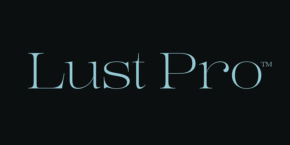
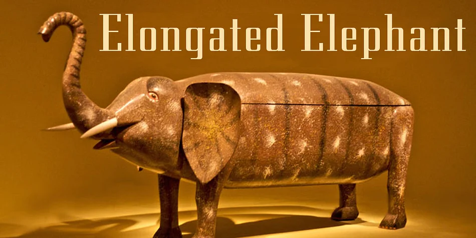
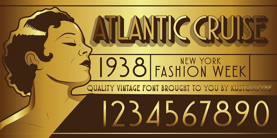
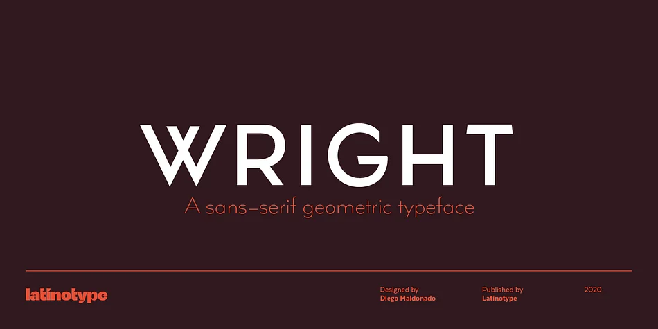
Matahari Sans Font is a decorative font that shines as a display or heading face. Pair it with a clean sans-serif or serif font for body text — the contrast creates a clear hierarchy while the two styles stay balanced and easy to read.

Matahari Sans Font
by Studio Sun
Reviewed by the FontBoxDL team · Updated May 2026