 Firefox
 1 / 7
1 / 7About Magedo Font
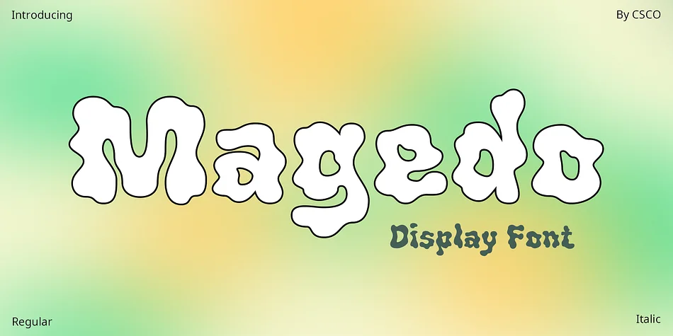
Magedo – Psychedelic Font: A Vivid Journey
Unleashing Creativity
The Magedo font draws inspiration from the swirling, vibrant world of psychedelic music. It embodies a visual trip, reminiscent of 1960s rock. This font captures the essence of an era defined by its bold, experimental spirit. Every character in Magedo bursts with creativity, inviting designers to explore uncharted territories.
Design Features
Magedo’s letters twist and turn, mimicking the fluidity of sound and music. Its design features exaggerated forms and undulating lines. This font displays a kaleidoscope of colors, blending seamlessly into one another. The use of bright, contrasting colors enhances its trippy aesthetic, making it perfect for eye-catching display designs.
Versatility in Use
Ideal for posters, album covers, and merchandise, Magedo speaks to music enthusiasts and artists alike. Its versatility extends to digital platforms, where it adds a touch of whimsy to websites and social media graphics. Despite its intricate design, Magedo maintains readability, ensuring your message stands out.
Engaging the Audience
Finally, Magedo is more than just a font; it’s an experience. It engages viewers, drawing them into a world where art and music collide. Whether used for commercial or personal projects, Magedo guarantees a unique, memorable impact. Embrace the psychedelic journey with Magedo and let your designs sing.
Style & Use Cases
- Overall Style
- Eye-catching, Bold
- Use Case
- Headlines, Logos
- Ideal For
- posters, branding, and social media graphics
- Pairs With
- a readable sans or serif for body
How to Install Magedo Font
Step-by-step instructions for every platform
- 1Download the Magedo font file (.ttf or .otf).
- 2Locate the downloaded file in your Downloads folder.
- 3Right-click the font file.
- 4Select "Install" to install for the current user, or "Install for all users" to make it available system-wide.
- 5Magedo is now available in Word, Photoshop, Illustrator, and all other apps.
More by Craft Supply Co.
View all →
Browse fonts by theme
Curated collections →Saw a font in a picture? Identify any font from an image with our free Font Finder.
More Display Fonts
Browse all →
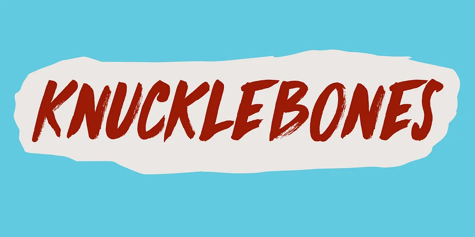
What pairs well with Magedo Font?
Magedo Font is a display font that shines as a display or heading face. Pair it with a clean sans-serif or serif font for body text — the contrast creates a clear hierarchy while the two styles stay balanced and easy to read.
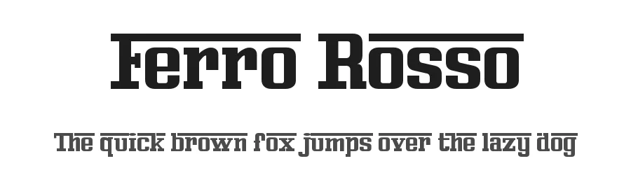
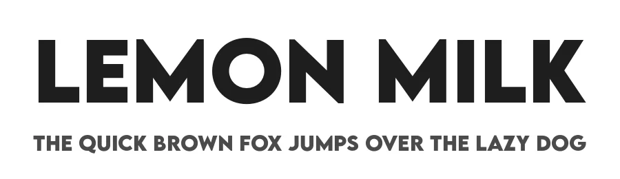
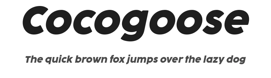

Magedo Font
Reviewed by the FontBoxDL team · Updated April 2026