
 1 / 3
1 / 3About Lovely Lines Font
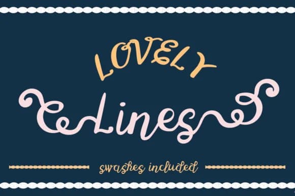
Lovely Lines by Lickable Pixels is a hand-drawn display script with organic, expressive character that brings authentic personality to your work. The font features distinctive initial and terminal swashes that add flourish and movement to letterforms, making it particularly effective for projects calling for warmth and individuality rather than rigid formality.
This typeface shines in personalized greeting cards, where flowing strokes convey genuine emotion and care. Wedding invitation suites benefit from its approachable charm, offering a refreshing alternative to traditional formal scripts. The font works beautifully for event menu design and handmade product packaging, bringing character and visual warmth through natural variations. Designers also find it ideal for creating distinctive social media quote graphics and expressive signage projects.
The swash elements provide multiple entry and exit points, allowing you to build layered compositions and unique letter arrangements that feel intentional rather than templated. Whether you're designing DIY craft signage, developing brand identity for independent makers, or creating display work that demands personality, Lovely Lines delivers the hand-lettered aesthetic without sacrificing readability. Find Lovely Lines on Creative Fabrica and add this character-driven typeface to your design toolkit.
Style & Use Cases
- Overall Style
- Elegant, Flowing, Lovely Lines
- Use Case
- Invitations, Branding
- Ideal For
- wedding stationery, greeting cards, and signatures
- Pairs With
- a simple uppercase sans
How to Install Lovely Lines Font Font
Step-by-step instructions for every platform
- 1Download the Lovely Lines Font font file (.ttf or .otf).
- 2Locate the downloaded file in your Downloads folder.
- 3Right-click the font file.
- 4Select "Install" to install for the current user, or "Install for all users" to make it available system-wide.
- 5Lovely Lines Font is now available in Word, Photoshop, Illustrator, and all other apps.
More by Lickable Pixels
View all →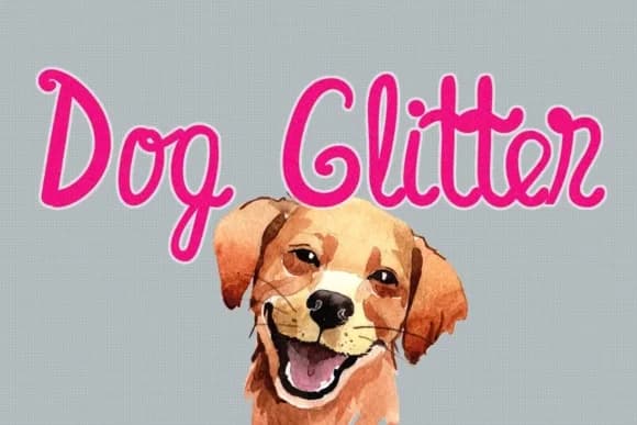
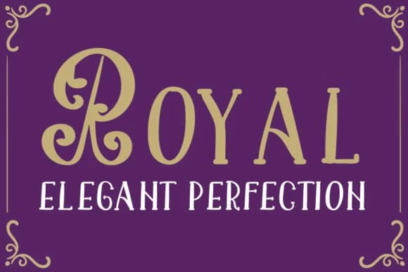
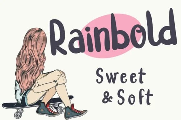
More Script Handwritten Fonts
Browse all →







What pairs well with Lovely Lines Font?
Lovely Lines Font is a script font that shines as a display or heading face. Pair it with a clean sans-serif or serif font for body text — the contrast creates a clear hierarchy while the two styles stay balanced and easy to read.



Lovely Lines Font
Reviewed by the FontBoxDL team · Updated May 2026