 Firefox
 1 / 3
1 / 3About Rainbold Font
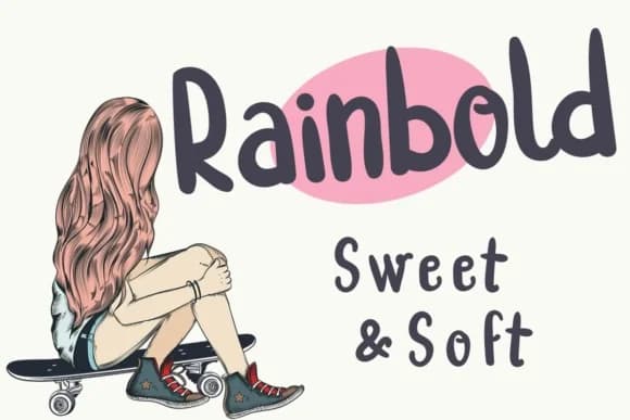
Rainbold by Lickable Pixels is a bold, rounded script that infuses designs with contemporary charm and accessible personality. The typeface features distinctly chunky, smooth letterforms that blend modern sensibility with friendly warmth, making it equally at home on digital screens or in printed materials.
This versatile script shines across diverse creative applications, from elegant wedding invitation suites and artisanal product packaging to engaging social media graphics and personalized greeting card collections. The rounded proportions create natural visual appeal for boutique branding initiatives, small business logos, and special event announcements that demand immediate attention. Each letter maintains consistent proportions and generous spacing, ensuring legibility whether displayed as prominent headlines or incorporated into shorter text passages.
Rainbold's bold weight delivers distinctive personality without sacrificing clarity, making it an excellent choice for designers seeking a typeface that balances visual impact with professionalism. The approachable aesthetic works particularly well for packaging labels, craft business signage, handmade product branding, and playful brand identities that want to foster genuine connection with audiences. Bring this distinctive character and warmth to your next creative project by adding Rainbold to your growing Creative Fabrica collection.
Style & Use Cases
- Overall Style
- Elegant, Flowing, Rainbold
- Use Case
- Invitations, Branding
- Ideal For
- wedding stationery, greeting cards, and signatures
- Pairs With
- a simple uppercase sans
How to Install Rainbold Font Font
Step-by-step instructions for every platform
- 1Download the Rainbold Font font file (.ttf or .otf).
- 2Locate the downloaded file in your Downloads folder.
- 3Right-click the font file.
- 4Select "Install" to install for the current user, or "Install for all users" to make it available system-wide.
- 5Rainbold Font is now available in Word, Photoshop, Illustrator, and all other apps.
More by Lickable Pixels
View all →

Browse fonts by theme
Curated collections →Saw a font in a picture? Identify any font from an image with our free Font Finder.
More Script Handwritten Fonts
Browse all →







What pairs well with Rainbold Font?
Rainbold Font is a script font that shines as a display or heading face. Pair it with a clean sans-serif or serif font for body text — the contrast creates a clear hierarchy while the two styles stay balanced and easy to read.



Rainbold Font
Reviewed by the FontBoxDL team · Updated May 2026