 Firefox
 1 / 10
About Duckie Sans Font
Presenting the ????️????Duckie Sans Cartoon Comic Typeface????????️ by alitdesign.
The Duckie Sans Cartoon Comic Typeface is inspired by the style of letters in comics that have less serious and fun characters. The lettering of the Duckie Sans Cartoon Comic Typeface is a sans serif with display font characters which gives a fun and design impression for children. The Duckie Sans Cartoon Comic Typeface has 2 family font slab serif and sans serif style. The Duckie Sans Cartoon Comic Typeface is perfect for creating designs with non-serious concepts, designs for children, book headers, and of course for text on comics.
The Duckie Sans Cartoon Comic Typeface also gets a bonus character of 230 Comic-themed illustrations that make creating designs even easier. Simply by downloading The Duckie Sans Cartoon Comic Typeface creating a Comic and non formal themed design is very quick and easy.
The Duckie Sans Cartoon Comic Typeface is perfect for magazine cover designs, brochures, flyers. Instagram ads, Canva Design and so on with comic, non-serious, pop art, game mobile and fun design. Besides that this font is very easy to use both in design and non-design programs because everything changes and glyphs are supported by Unicode (PUA).
The Duckie Sans Cartoon Comic Typeface contains 576 + 230 bonus glyphs with many unique and interesting alternative options.
Style & Use Cases
- Overall Style
- Eye-catching, Bold
- Use Case
- Headlines, Logos
- Ideal For
- posters, branding, and social media graphics
- Pairs With
- a readable sans or serif for body
How to Install Duckie Sans Font
Step-by-step instructions for every platform
- 1Download the Duckie Sans font file (.ttf or .otf).
- 2Locate the downloaded file in your Downloads folder.
- 3Right-click the font file.
- 4Select "Install" to install for the current user, or "Install for all users" to make it available system-wide.
- 5Duckie Sans is now available in Word, Photoshop, Illustrator, and all other apps.
More by Alit Design
View all →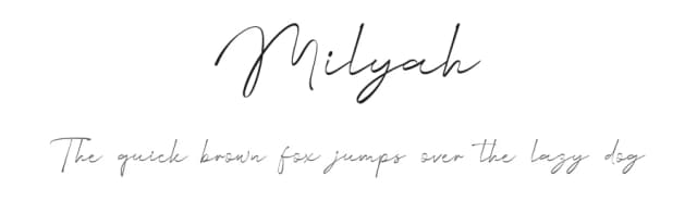
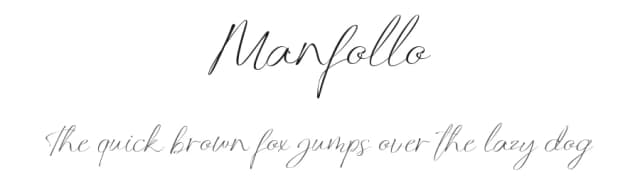
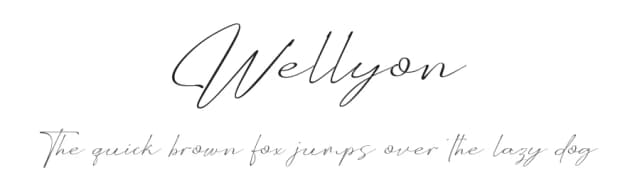
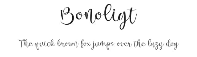
Browse fonts by theme
Curated collections →Saw a font in a picture? Identify any font from an image with our free Font Finder.
More Display Fonts
Browse all →







What pairs well with Duckie Sans Font?
Duckie Sans Font is a display font that shines as a display or heading face. Pair it with a clean sans-serif or serif font for body text — the contrast creates a clear hierarchy while the two styles stay balanced and easy to read.



Duckie Sans Font
by Alit Design
Reviewed by the FontBoxDL team · Updated April 2026