 Firefox
 1 / 6
1 / 6About CS Caustic Font
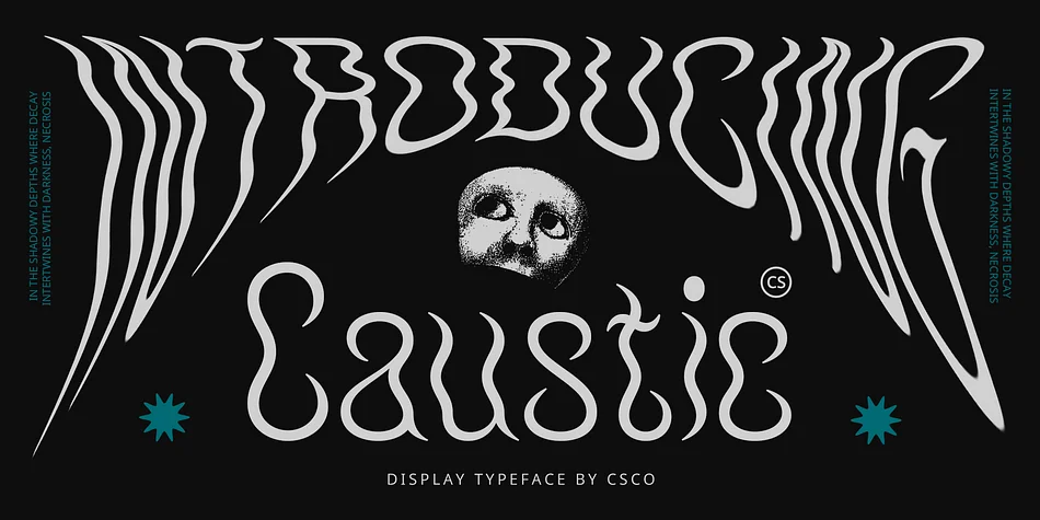
CS Caustic – Psychedelic Font: Vibrant Expression with a Funky Twist
Modern Display with Psychedelic Flair
CS Caustic is a modern display font that infuses psychedelic and funky elements into its design. Psychedelic style, inspired by the visual aesthetics of the 1960s and 1970s, is characterized by letters that curve, wave, and distort, creating a dynamic and visually engaging effect. This font embraces the bold and expressive nature of psychedelic art, offering a fresh and energetic look.
Funky Creativity for a Unique Appeal
The funky aspect of CS Caustic brings an additional layer of cheerfulness and creativity. The letters feature unconventional characters with playful patterns and bright colors, adding a lively and distinctive touch to any design. This combination of psychedelic and funky elements results in a font that’s both eye-catching and unique, perfect for capturing attention and sparking interest.
Ideal for Energetic and Creative Projects
CS Caustic is perfect for designs that need to make a statement and stand out. Its vibrant and expressive style makes it ideal for music posters, creative event promotions, and any material that aims to project an energetic and distinctive vibe. Whether you’re looking to evoke the spirit of a bygone era or simply add a touch of bold creativity, CS Caustic delivers a memorable and engaging visual experience.
Style & Use Cases
- Overall Style
- Eye-catching, Bold
- Use Case
- Headlines, Logos
- Ideal For
- posters, branding, and social media graphics
- Pairs With
- a readable sans or serif for body
How to Install CS Caustic Font
Step-by-step instructions for every platform
- 1Download the CS Caustic font file (.ttf or .otf).
- 2Locate the downloaded file in your Downloads folder.
- 3Right-click the font file.
- 4Select "Install" to install for the current user, or "Install for all users" to make it available system-wide.
- 5CS Caustic is now available in Word, Photoshop, Illustrator, and all other apps.
More by Craft Supply Co.
View all →

Browse fonts by theme
Curated collections →Saw a font in a picture? Identify any font from an image with our free Font Finder.
More Display Fonts
Browse all →
What pairs well with CS Caustic Font?
CS Caustic Font is a display font that shines as a display or heading face. Pair it with a clean sans-serif or serif font for body text — the contrast creates a clear hierarchy while the two styles stay balanced and easy to read.

CS Caustic Font
Reviewed by the FontBoxDL team · Updated April 2026