 Firefox
 1 / 6
1 / 6About CS Carline Font
CS Carline – Art Nouveau Sans-Serif Font
Elegant Curves and Decorative Details
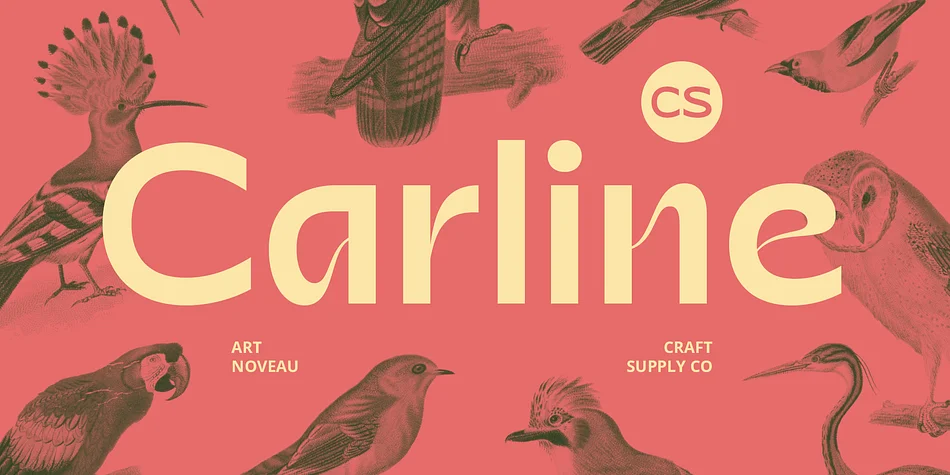
CS Carline is a modern sans-serif font infused with Art Nouveau style, featuring elegant curves and ornate decorative details. The design harmoniously blends organic beauty with contemporary sophistication, creating a luxurious and artistic impression. The fluid lines and intricate flourishes of CS Carline evoke the grace of early 20th-century decorative art while maintaining a fresh and modern appeal.
Refined and Artistic Impression
Perfect for applications that require a touch of natural beauty and refinement, CS Carline excels in enhancing both interior design and promotional materials. Its elegant and artistic characteristics bring a sense of luxury and sophistication to a variety of projects. Whether used in upscale branding, high-end invitations, or creative marketing, this font adds a distinctive and refined aesthetic to any design.
Versatile for Modern and Elegant Design
CS Carline is versatile and ideal for creating spaces and materials that highlight a blend of modern elegance and artistic charm. Its graceful curves and decorative elements make it an excellent choice for projects that aim to captivate with a touch of classic beauty in a contemporary context. From interior design to promotional campaigns, CS Carline provides a sophisticated and enchanting visual experience.
Style & Use Cases
- Overall Style
- Eye-catching, Bold
- Use Case
- Headlines, Logos
- Ideal For
- posters, branding, and social media graphics
- Pairs With
- a readable sans or serif for body
How to Install CS Carline Font
Step-by-step instructions for every platform
- 1Download the CS Carline font file (.ttf or .otf).
- 2Locate the downloaded file in your Downloads folder.
- 3Right-click the font file.
- 4Select "Install" to install for the current user, or "Install for all users" to make it available system-wide.
- 5CS Carline is now available in Word, Photoshop, Illustrator, and all other apps.
More by Craft Supply Co.
View all →



Browse fonts by theme
Curated collections →Saw a font in a picture? Identify any font from an image with our free Font Finder.
More Display Fonts
Browse all →



What pairs well with CS Carline Font?
CS Carline Font is a display font that shines as a display or heading face. Pair it with a clean sans-serif or serif font for body text — the contrast creates a clear hierarchy while the two styles stay balanced and easy to read.




CS Carline Font
Reviewed by the FontBoxDL team · Updated April 2026