 Firefox
 1 / 10
About The Western Gold Font
Howdy cowboy, say hello to “The Western Gold” a brand new western font, inspired by classic American wood sign style. Powered with opentype features (Alternates & ligatures) - Mulitilingual ready!
Perfect and suitable for branding, headline, logotype, sticker, editorial design, and etc.
Multi languages included: Afrikaans, Albanian, Asu, Basque, Bemba, Bena, Cebuano, Chiga, Cornish, Corsican, Danish, Embu, English, Estonian, Filipino, Finnish, French, Friulian, Galician, German, Gusii, Ido, Indonesian, Interlingua, Irish, Italian, Javanese, Jju, Kabuverdianu, Kalaallisut, Kalenjin, Kamba, Kikuyu, Kinyarwanda, Kurdish, Lojban, Low German, Luo, Luxembourgish, Luyia, Machame, Makhuwa-Meetto, Makonde, Malagasy, Malay, Manx, Meru, Morisyen, North Ndebele, Northern Sotho, Norwegian Bokmål, Norwegian Nynorsk, Nyanja, Nyankole, Occitan, Oromo, Portuguese, Romansh, Rombo, Rundi, Rwa, Samburu, Sango, Sangu, Sardinian, Scottish Gaelic, Sena, Shambala, Shona, Slovenian, Soga, Somali, South Ndebele, Southern Sotho, Spanish, Swahili, Swati, Swedish, Swiss German, Taita, Taroko, Teso, Tsonga, Tswana, Turkmen, Vunjo, Walloon, Walser, Xhosa, Zulu
Product Content:
The Western Gold.OTF
The Western Gold.TTF
The Western Gold.WOFF
The Western Gold.WOFF2
Features:
A-Z Character Set
a-z Characters set
Numerals & Punctuations (OpenType Standard)
Alternate Uppercase & Lowercase
ligature
Multilingual
Thanks, Eric
Style & Use Cases
- Overall Style
- Bold, Distinctive
- Use Case
- Headlines, Posters
- Ideal For
- logos, packaging, and standout titles
- Pairs With
- a neutral sans-serif
How to Install The Western Gold Font
Step-by-step instructions for every platform
- 1Download the The Western Gold font file (.ttf or .otf).
- 2Locate the downloaded file in your Downloads folder.
- 3Right-click the font file.
- 4Select "Install" to install for the current user, or "Install for all users" to make it available system-wide.
- 5The Western Gold is now available in Word, Photoshop, Illustrator, and all other apps.
More by Burntilldead
View all →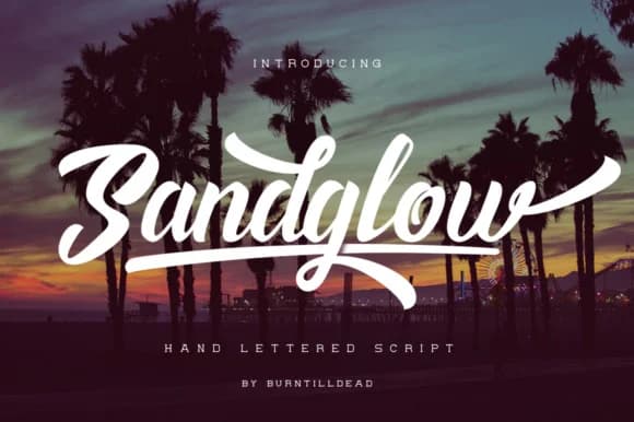
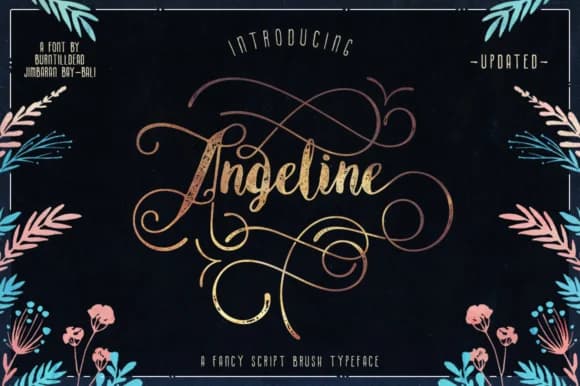
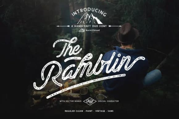
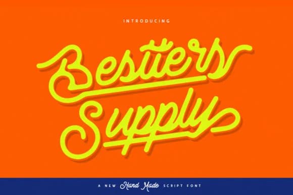
Browse fonts by theme
Curated collections →Saw a font in a picture? Identify any font from an image with our free Font Finder.
More Decorative Fonts
Browse all →







What pairs well with The Western Gold Font?
The Western Gold Font is a decorative font that shines as a display or heading face. Pair it with a clean sans-serif or serif font for body text — the contrast creates a clear hierarchy while the two styles stay balanced and easy to read.



The Western Gold Font
by Burntilldead
Reviewed by the FontBoxDL team · Updated May 2026