
 1 / 6
1 / 6About Steady & Silky Font
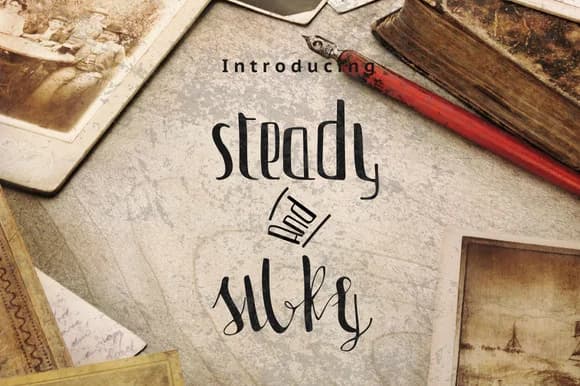
Steady & Silky Font by Ajir is a flowing handwritten script that marries precision with organic beauty. The typeface balances confident letterforms with a smooth, graceful quality that feels both contemporary and timeless, offering visual warmth that resonates across diverse creative disciplines.
This script font works exceptionally well for identity projects seeking a personal touch without sacrificing polish. Consider it for wedding invitation suites that need warmth alongside sophistication, boutique skincare labels requiring an upscale yet approachable voice, or lifestyle brand packaging where personality matters. DIY craft creators will appreciate how the letterforms render clearly at small sizes, making it suitable for custom vinyl projects and handmade product tags. Social media content creators benefit from its readability when used in story graphics or post headlines.
The typeface maintains consistent letterform weight throughout its character set, ensuring professional results across both digital and print applications. Whether you're designing a luxury packaging suite, curating editorial layouts with distinctive voice, building branded social content, or creating personalized event materials, this font delivers refined elegance that reads as genuinely handwritten rather than artificially digital. Bring the natural rhythm of Steady & Silky Font to your next creative project by finding it on Creative Fabrica.
Style & Use Cases
- Overall Style
- Elegant, Flowing, Steady Silky
- Use Case
- Invitations, Branding
- Ideal For
- wedding stationery, greeting cards, and signatures
- Pairs With
- a simple uppercase sans
How to Install Steady & Silky Font Font
Step-by-step instructions for every platform
- 1Download the Steady & Silky Font font file (.ttf or .otf).
- 2Locate the downloaded file in your Downloads folder.
- 3Right-click the font file.
- 4Select "Install" to install for the current user, or "Install for all users" to make it available system-wide.
- 5Steady & Silky Font is now available in Word, Photoshop, Illustrator, and all other apps.
More Script Handwritten Fonts
Browse all →







What pairs well with Steady & Silky Font?
Steady & Silky Font is a script font that shines as a display or heading face. Pair it with a clean sans-serif or serif font for body text — the contrast creates a clear hierarchy while the two styles stay balanced and easy to read.



Steady & Silky Font
by Ajir
Reviewed by the FontBoxDL team · Updated May 2026