 Firefox
 1 / 6
1 / 6About Sketchnote Font
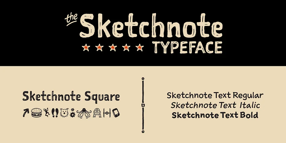
Sketchnote by Mike Rhode is a hand-drawn script typeface built from practical need. When creating "The Sketchnote Handbook," he required fonts that captured genuine handwriting characteristics alongside the spontaneity of drawn letterforms. Rather than smoothing away those raw qualities, the design preserves ink texture and paper grain: the actual physical traces of pen on page show through the digital forms.
The family covers multiple roles. Sketchnote Text comes in Regular, Bold, and Italic weights for flowing body copy, while Sketchnote Square takes a bolder, more geometric approach for headlines and callouts. OpenType features automatically swap between over 240 letter alternates in each text weight, recreating the natural inconsistency of genuine handwriting. Add Sketchnote Dingbats to the mix for functional icons, ornaments, and visual flourishes that extend the hand-drawn language across your work.
This works exceptionally well for sketchnote presentations and visual note-taking, creative journal spreads, illustrated recipe cards, and comic or graphic novel lettering. The slight irregularity and organic feel bring authenticity to handmade branding, educational workbooks, and any design calling for genuine handwritten warmth. Grab Sketchnote on Creative Fabrica and start layering personality into your next project.
Style & Use Cases
- Overall Style
- Iconographic
- Use Case
- Icons, Accents
- Ideal For
- ornaments, bullets, and decorative flourishes
- Pairs With
- any text font
How to Install Sketchnote Font
Step-by-step instructions for every platform
- 1Download the Sketchnote font file (.ttf or .otf).
- 2Locate the downloaded file in your Downloads folder.
- 3Right-click the font file.
- 4Select "Install" to install for the current user, or "Install for all users" to make it available system-wide.
- 5Sketchnote is now available in Word, Photoshop, Illustrator, and all other apps.
More by Delve Fonts
View all →
Browse fonts by theme
Curated collections →Saw a font in a picture? Identify any font from an image with our free Font Finder.
More Dingbats Fonts
Browse all →

What pairs well with Sketchnote Font?
Sketchnote Font is a versatile dingbats font that works for both headings and body text. Pair it with a contrasting sans-serif or serif font to add visual interest and a clear distinction between titles and body copy.

Sketchnote Font
by Delve Fonts
Reviewed by the FontBoxDL team · Updated August 2026