
 1 / 2
1 / 2About Party Dot Font
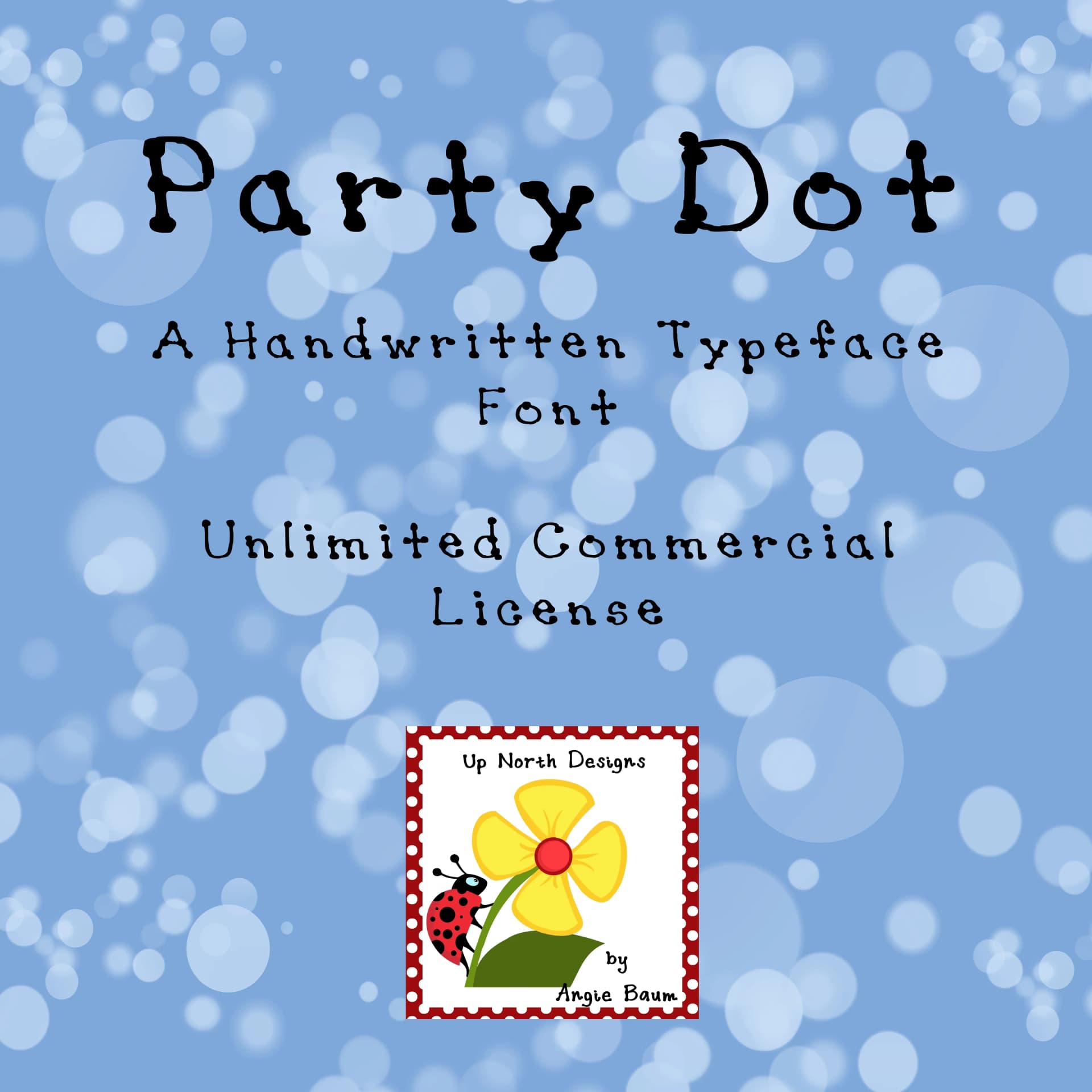
Party Dot by upnorthdesignsabaum is a playful handwritten script that brings casual charm and personality to any creative project. With a friendly, approachable character, this font excels at adding warmth to celebration designs that need that authentic hand-drawn feel without compromising readability. The typeface is particularly well-suited for birthday party invitations, personalized greeting cards, event programs, festive poster designs, and casual brand identities that want to feel more human and less corporate.
The complete character set includes both uppercase and lowercase letters, numerals, and punctuation marks, offering a total of 95 glyphs to work with across your designs. This robust glyph set ensures you'll have all the essential characters needed for most applications, from simple text layouts to more elaborate typographic arrangements. Whether you're designing for print or digital platforms, Party Dot delivers the spontaneous energy of handwriting while maintaining consistent, easy-to-read letterforms throughout.
The font's versatility makes it ideal for scrapbooking layouts, DIY craft projects, event stationery, and any project that benefits from a lighthearted, personable touch. Its playful nature works especially well when you want typography that doesn't take itself too seriously but still communicates effectively.
Discover Party Dot on Creative Fabrica and bring authentic handwritten character to your next celebration or social design.
Style & Use Cases
- Overall Style
- Elegant, Flowing, Party Dot
- Use Case
- Invitations, Branding
- Ideal For
- wedding stationery, greeting cards, and signatures
- Pairs With
- a simple uppercase sans
How to Install Party Dot Font Font
Step-by-step instructions for every platform
- 1Download the Party Dot Font font file (.ttf or .otf).
- 2Locate the downloaded file in your Downloads folder.
- 3Right-click the font file.
- 4Select "Install" to install for the current user, or "Install for all users" to make it available system-wide.
- 5Party Dot Font is now available in Word, Photoshop, Illustrator, and all other apps.
More Script Handwritten Fonts
Browse all →







What pairs well with Party Dot Font?
Party Dot Font is a script font that shines as a display or heading face. Pair it with a clean sans-serif or serif font for body text — the contrast creates a clear hierarchy while the two styles stay balanced and easy to read.



Party Dot Font
Reviewed by the FontBoxDL team · Updated May 2026