 Firefox
 1 / 3
1 / 3Loading font…
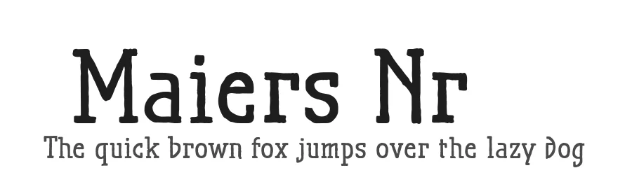
About Maiers Nr.21 Font
Very geometrical, rigid forms borrowed from the typical characteristics of Jugendstil/Art Nouveau
This script is found in a magazine from the Otto Maier publishing house, Ravensburg, which was issued sometime in the years shortly before WWI. The magazine is entitled Schriften-Sammlung für Techniker: Verkleinerte Schriften der wichtigsten Alphabete (Collection of scripts for technical specialists: reduced scripts of the most significant alphabets) and published by Karl O. Maier. The original copy, produced by means of a galvanized plate, is just 7 centimeters wide. It served as the model for technical professions in which, at that time, the captions of drawings were still done by hand.
The characters have been scanned, digitized and greatly magnified. Special attention was given to ensure the uneven edges, typical of handwritten script, remained effectively noticeable even in the digitized form. As a result, this technical font retains a handmade touch.
Especially worthy of note are the Jugendstil forms characteristic at the turn of the19th century.
In comparison, many alleged ultramodern font types of today suddenly look quite old-fashioned.
The font downloadable here is a reduced version (without punctuation, ligatures, numbers etc.). A commercial version of this font (with all features) is available at
www.ingofonts.com
.
Style & Use Cases
- Overall Style
- Bold, Bold, Distinctive, Fancy
- Use Case
- Headlines, Posters
- Ideal For
- logos, packaging, and standout titles
- Pairs With
- a neutral sans-serif
Similar Fonts
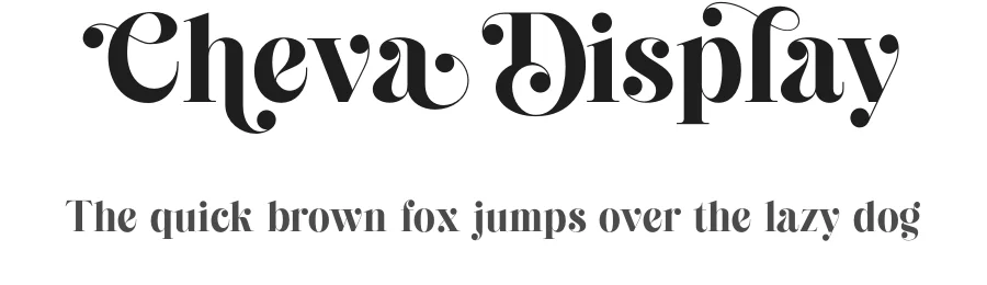
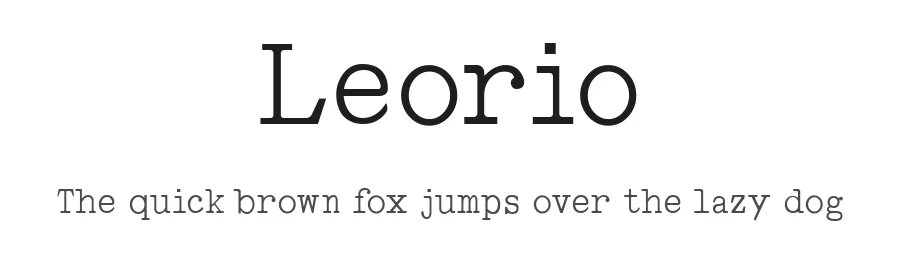
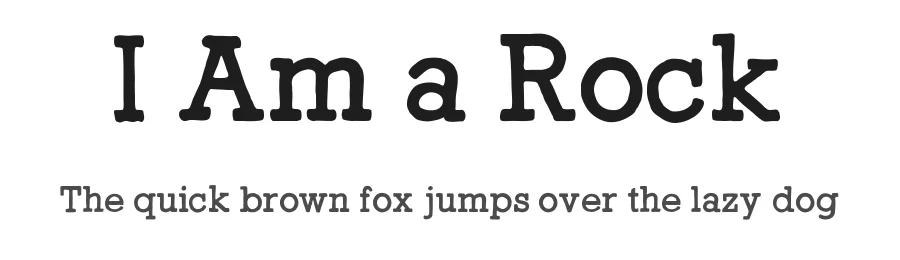
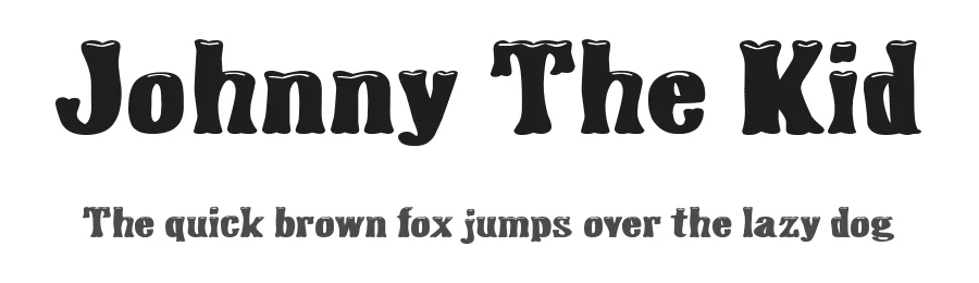
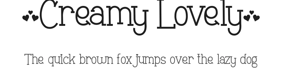
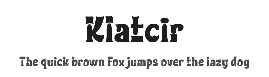
Fonts that look visually alike — matched by our Font Finder model.
Maiers Nr.21 Specifications
| Font Family | Maiers Nr.21 Reduced |
| Style | Bold |
| Full Name | MaiersNr.Reduced-Bold |
| Version | 3.003 |
| Weight | 700 (Bold) |
| Glyph Count | 56 glyphs |
| PostScript Name | MaiersNr.Reduced-Bold |
| Designer | Ingo Zimmermann |
| Format | OTF (CFF) |
| File Size | 28.2 KB |
Languages Supported
Maiers Nr.21 supports 89 languages.
How to Install Maiers Nr.21 Font
Step-by-step instructions for every platform
- 1Download the Maiers Nr.21 font file (.ttf or .otf).
- 2Locate the downloaded file in your Downloads folder.
- 3Right-click the font file.
- 4Select "Install" to install for the current user, or "Install for all users" to make it available system-wide.
- 5Maiers Nr.21 is now available in Word, Photoshop, Illustrator, and all other apps.
More by ingoFonts
View all →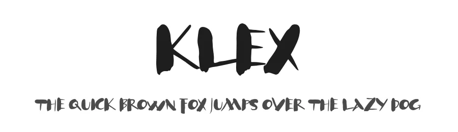

Browse fonts by theme
Curated collections →Saw a font in a picture? Identify any font from an image with our free Font Finder.
More Decorative Fonts
Browse all →
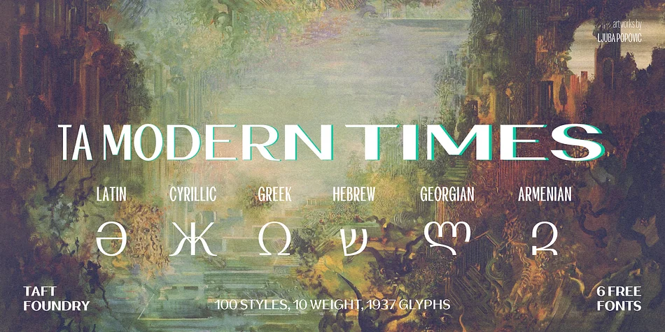



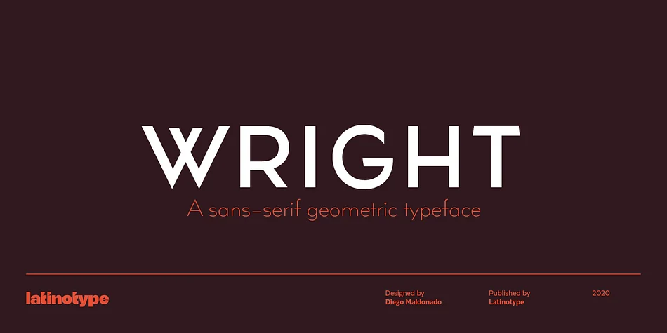
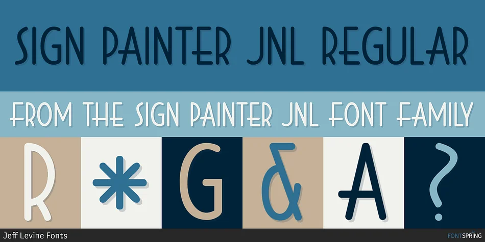
What pairs well with Maiers Nr.21 Font?
Maiers Nr.21 Font is a decorative font that shines as a display or heading face. Pair it with a clean sans-serif or serif font for body text — the contrast creates a clear hierarchy while the two styles stay balanced and easy to read.
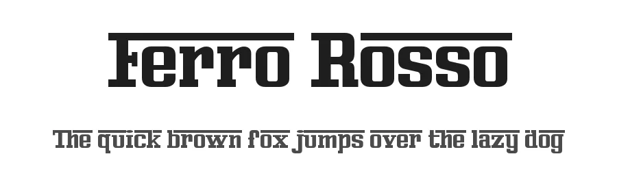



Premium Decorative Fonts
★ PremiumWant something with more weights, glyphs, and commercial polish? These premium decorative fonts are worth a look.
Maiers Nr.21 Font
by ingoFonts
Reviewed by the FontBoxDL team · Updated June 2026