
 1 / 4
1 / 4About Laks Font
Laks by Laks Mi is a playful handwritten script that captures the spontaneous charm of hand-lettering while maintaining consistently readable character forms. With its casual, youthful aesthetic, this typeface brings genuine personality to any project where approachability and warmth matter most, offering authentic appeal without sacrificing legibility.
This distinctive script excels in applications aimed at younger audiences and creative professionals seeking authentic hand-drawn character. The loose, natural letterforms work particularly well for children's book illustration spreads where visual warmth establishes tone, personalized birthday party invitation designs that benefit from friendly handwriting charm, and nursery room wall decals that need to feel inviting and approachable. The playful style also translates beautifully to custom t-shirt graphics and clothing designs where hand-lettered aesthetic enhances brand personality, as well as product packaging for children's items, stationery sets, and lifestyle brands targeting families.
Whether you're designing hand-lettered greeting cards, creating detailed scrapbooking layouts, or producing engaging social media graphics and promotional content, Laks delivers authentic character that resonates with audiences. The typeface works equally well for DIY craft projects and professional design applications. Get the font on Creative Fabrica and bring your projects to life with this charming, approachable script.
Style & Use Cases
- Overall Style
- Elegant, Flowing, Laks
- Use Case
- Invitations, Branding
- Ideal For
- wedding stationery, greeting cards, and signatures
- Pairs With
- a simple uppercase sans
How to Install Laks Font Font
Step-by-step instructions for every platform
- 1Download the Laks Font font file (.ttf or .otf).
- 2Locate the downloaded file in your Downloads folder.
- 3Right-click the font file.
- 4Select "Install" to install for the current user, or "Install for all users" to make it available system-wide.
- 5Laks Font is now available in Word, Photoshop, Illustrator, and all other apps.
More by Laks Mi
View all →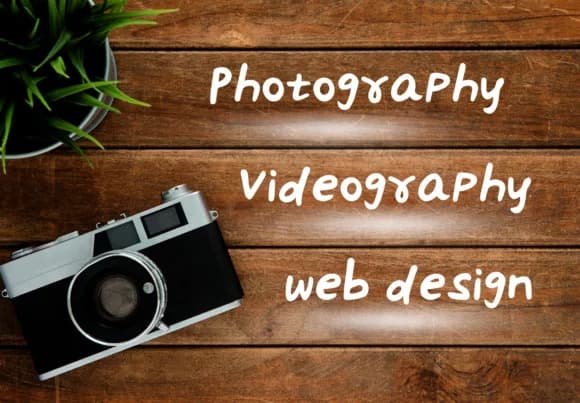
More Script Handwritten Fonts
Browse all →







What pairs well with Laks Font?
Laks Font is a script font that shines as a display or heading face. Pair it with a clean sans-serif or serif font for body text — the contrast creates a clear hierarchy while the two styles stay balanced and easy to read.



Laks Font
by Laks Mi
Reviewed by the FontBoxDL team · Updated May 2026