 Firefox
 1 / 10
About Klapt Cyrillic Font
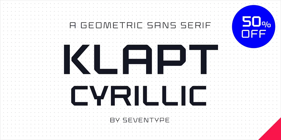
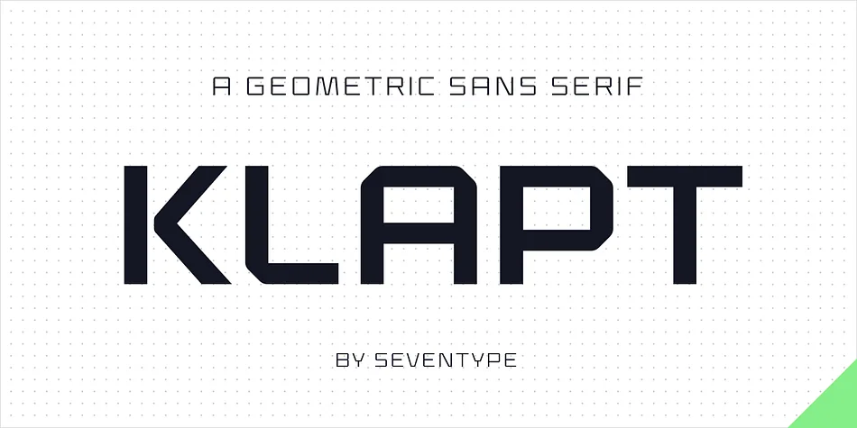
Klapt Cyrillic, designed by SevenType, plays with contrast in a way that few geometric sans serifs do. The letterforms appear soft and approachable at first glance, but look closer and you'll find sharp, precise angles cutting through each character. This balance between warmth and precision creates a distinctive personality that feels both contemporary and grounded, avoiding the cold, sterile feeling that purely geometric typefaces sometimes carry.
The family ships in four weights and carries extensive support for Latin, extended Cyrillic, Vietnamese, Serbian, Bulgarian, and many other scripts. That makes it a genuine workhorse for truly multilingual projects and international design work. Language support becomes particularly valuable when you're building identity systems that need to function across multiple markets and regions. The geometric construction works beautifully for tech startup branding, magazine mastheads and editorial headlines, Cyrillic book cover design, sophisticated packaging for international markets, and minimal logo systems where a single mark needs to do most of the heavy lifting.
Klapt Cyrillic suits designers working on display projects that need to feel modern without looking trendy or temporary. It's especially valuable for audiences across Eastern Europe, Russia, and multilingual design contexts where language and cultural specificity genuinely matter. Download the full family from Creative Fabrica.
Style & Use Cases
- Overall Style
- Eye-catching, Bold
- Use Case
- Headlines, Logos
- Ideal For
- posters, branding, and social media graphics
- Pairs With
- a readable sans or serif for body
How to Install Klapt Cyrillic Font
Step-by-step instructions for every platform
- 1Download the Klapt Cyrillic font file (.ttf or .otf).
- 2Locate the downloaded file in your Downloads folder.
- 3Right-click the font file.
- 4Select "Install" to install for the current user, or "Install for all users" to make it available system-wide.
- 5Klapt Cyrillic is now available in Word, Photoshop, Illustrator, and all other apps.
More by SevenType
View all →

Browse fonts by theme
Curated collections →Saw a font in a picture? Identify any font from an image with our free Font Finder.
More Display Fonts
Browse all →

What pairs well with Klapt Cyrillic Font?
Klapt Cyrillic Font is a display font that shines as a display or heading face. Pair it with a clean sans-serif or serif font for body text — the contrast creates a clear hierarchy while the two styles stay balanced and easy to read.

Klapt Cyrillic Font
by SevenType
Reviewed by the FontBoxDL team · Updated May 2026