
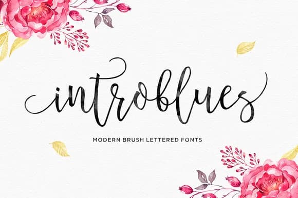
 1 / 8
1 / 8About Introblues Font
Introblues Font by Dhan Studio is a handwritten script typeface that brings genuine warmth and personality to design work. The flowing letterforms capture the organic quality of authentic hand-lettering, delivering a personal touch that feels both natural and refined enough for polished professional applications.
This distinctive script excels across a variety of creative contexts. Designers choose it for wedding invitation suites seeking sophisticated elegance, custom greeting card designs that need genuine character, small business branding that emphasizes handmade authenticity, and craft project labels where artisanal appeal matters. The fluid letterforms and expressive stroke variations add dimensionality to packaging designs, social media content, and editorial layouts. Whether crafting delicate stationery for special occasions or developing cohesive brand identities for maker businesses, Introblues delivers the visual warmth that hand-lettered fonts are prized for.
The typeface bridges the gap between DIY creativity and professional design standards. Crafters and designers alike find its natural-looking character inspires confidence whether they're creating vinyl decals, custom illustrations, or branded marketing materials. The authentic aesthetic of Introblues means your designs communicate genuine care and artistry. Get Introblues Font from Creative Fabrica to bring authentic hand-lettered character to your next project.
Style & Use Cases
- Overall Style
- Elegant, Flowing, Introblues Script
- Use Case
- Invitations, Branding
- Ideal For
- wedding stationery, greeting cards, and signatures
- Pairs With
- a simple uppercase sans
How to Install Introblues Font Font
Step-by-step instructions for every platform
- 1Download the Introblues Font font file (.ttf or .otf).
- 2Locate the downloaded file in your Downloads folder.
- 3Right-click the font file.
- 4Select "Install" to install for the current user, or "Install for all users" to make it available system-wide.
- 5Introblues Font is now available in Word, Photoshop, Illustrator, and all other apps.
More by Dhan Studio
View all →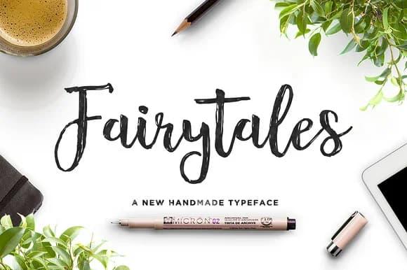
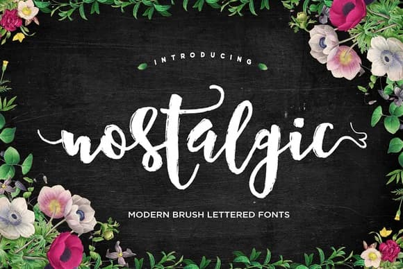
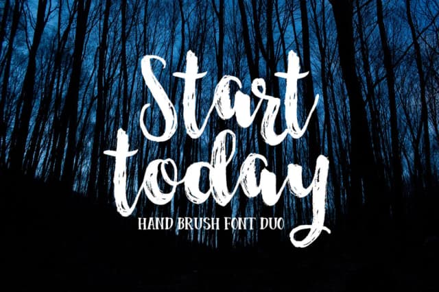
More Script Handwritten Fonts
Browse all →







What pairs well with Introblues Font?
Introblues Font is a script font that shines as a display or heading face. Pair it with a clean sans-serif or serif font for body text — the contrast creates a clear hierarchy while the two styles stay balanced and easy to read.



Introblues Font
by Dhan Studio
Reviewed by the FontBoxDL team · Updated May 2026