
 1 / 2
1 / 2About Homin Fun Font
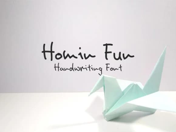
Homin Fun Font by DjanCook Studio is a friendly handwritten typeface that brings genuine warmth and authentic personality to any creative project. With its casual, approachable letterforms, this script is ideal for wedding invitation suites, personalized greeting card designs, and handmade gift tags that leave lasting impressions on recipients. The font's natural character also works beautifully for DIY craft signage, scrapbook page layouts, hand-lettered labels for boutique product packaging, and event menu design. Whether you're creating intimate event stationery, designing eye-catching social media graphics and posts, or crafting personalized correspondence, Homin Fun delivers the authentic handwritten aesthetic that resonates with modern audiences seeking true, human-made appeal in their designs. This typeface comes equipped with a comprehensive character set that supports standard typography needs, making it versatile across various design applications and mediums. The playful yet legible design maintains excellent clarity at different scales, ensuring your messaging remains effective whether you're developing digital designs, print projects, website signage, or other creative endeavors. Its friendly, approachable personality adds a distinctive touch of individuality to any project that calls for warmth and authentic human connection through lettering work. Add authentic handwritten charm to all your designs, get Homin Fun Font on Creative Fabrica.
How to Install Homin Fun Font Font
Step-by-step instructions for every platform
- 1Download the Homin Fun Font font file (.ttf or .otf).
- 2Locate the downloaded file in your Downloads folder.
- 3Right-click the font file.
- 4Select "Install" to install for the current user, or "Install for all users" to make it available system-wide.
- 5Homin Fun Font is now available in Word, Photoshop, Illustrator, and all other apps.
More Script Handwritten Fonts
Browse all →







What pairs well with Homin Fun Font?
Homin Fun Font is a script font that shines as a display or heading face. Pair it with a clean sans-serif or serif font for body text — the contrast creates a clear hierarchy while the two styles stay balanced and easy to read.


