
 1 / 6
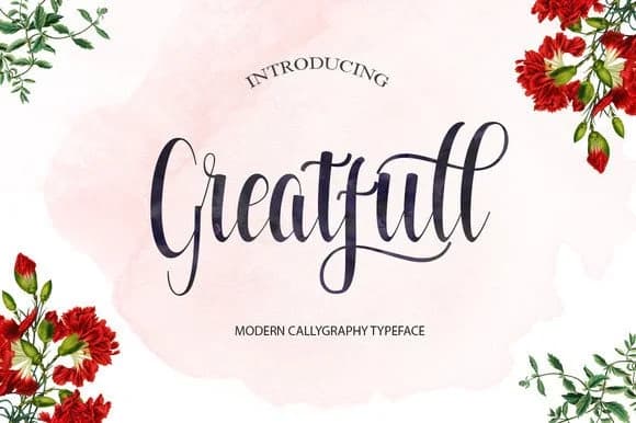
1 / 6About Greatfull Font
Greatfull Font by Polem is a flowing script typeface that authentically captures the warmth of hand lettering through graceful letterforms and natural, expressive strokes. This handwritten style brings a personal and heartfelt quality to typography, offering designers a genuine way to convey intimacy and sophistication in equal measure, without relying on overwrought embellishment or artificial flourishes. The font excels across multiple creative applications: custom wedding stationery and invitation suites, artisanal product labeling for boutique brands, personalized greeting card collections, and sophisticated hand-lettered packaging design that demands visual distinction. Whether you're developing calligraphy-inspired event invitations, creating logo treatments with authentic appeal, crafting social media graphics with a personal touch, or designing branded merchandise and custom signage, Greatfull delivers flowing letterforms that feel naturally made and emotionally resonant. The script works equally well across digital and print formats, making it a versatile choice for projects seeking warmth and humanity. Built for modern design workflows, the typeface integrates seamlessly with all major design platforms including Adobe Creative Suite and Canva. Add Greatfull to your font collection on Creative Fabrica to bring authentic handwritten character to your next design project.
Style & Use Cases
- Overall Style
- Elegant, Flowing, Greatfull
- Use Case
- Invitations, Branding
- Ideal For
- wedding stationery, greeting cards, and signatures
- Pairs With
- a simple uppercase sans
How to Install Greatfull Font Font
Step-by-step instructions for every platform
- 1Download the Greatfull Font font file (.ttf or .otf).
- 2Locate the downloaded file in your Downloads folder.
- 3Right-click the font file.
- 4Select "Install" to install for the current user, or "Install for all users" to make it available system-wide.
- 5Greatfull Font is now available in Word, Photoshop, Illustrator, and all other apps.
More Script Handwritten Fonts
Browse all →







What pairs well with Greatfull Font?
Greatfull Font is a script font that shines as a display or heading face. Pair it with a clean sans-serif or serif font for body text — the contrast creates a clear hierarchy while the two styles stay balanced and easy to read.



Greatfull Font
by Polem
Reviewed by the FontBoxDL team · Updated May 2026