
 1 / 8
1 / 8About Ematodas Font
Ematodas by Subqi Std is a bold brush script typeface that captures the organic texture of hand-drawn letterforms with authentic character. The design features a distinctive dry brush aesthetic that gives it visual depth and presence, making it stand out in applications where handwritten quality matters.
This versatile script font excels across multiple creative projects. It's particularly suited for wedding invitation suites, where the brush quality brings personality and warmth to stationery that feels genuinely personal and thoughtful. Boutique brands use Ematodas for product labels and packaging, especially in the artisanal goods and cosmetics sectors where handcrafted aesthetics strengthen brand identity. Event posters and announcements also benefit from its refined stroke work and visual presence. The typeface performs well across different text sizes, from detailed work to larger display applications.
The design includes both uppercase and lowercase letterforms, allowing you to experiment with mixed-case styling and varied typographic layouts. This flexibility lets you create different visual compositions based on your project needs. Whether you're working on digital platforms or print materials, Ematodas brings the handcrafted character that contemporary designs often call for. Get Ematodas on Creative Fabrica and add this brush script to your font collection.
Style & Use Cases
- Overall Style
- Elegant, Flowing, Ematodas
- Use Case
- Invitations, Branding
- Ideal For
- wedding stationery, greeting cards, and signatures
- Pairs With
- a simple uppercase sans
How to Install Ematodas Font Font
Step-by-step instructions for every platform
- 1Download the Ematodas Font font file (.ttf or .otf).
- 2Locate the downloaded file in your Downloads folder.
- 3Right-click the font file.
- 4Select "Install" to install for the current user, or "Install for all users" to make it available system-wide.
- 5Ematodas Font is now available in Word, Photoshop, Illustrator, and all other apps.
More by Subqi Std
View all →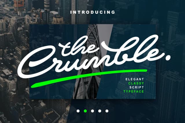
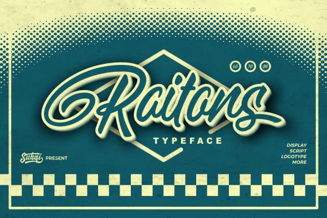
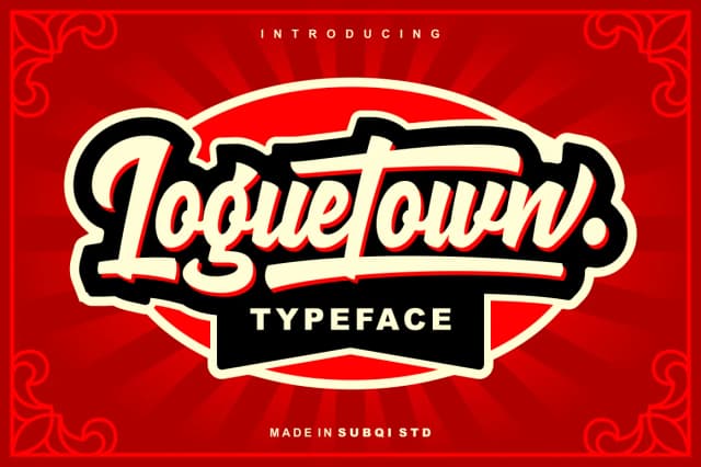
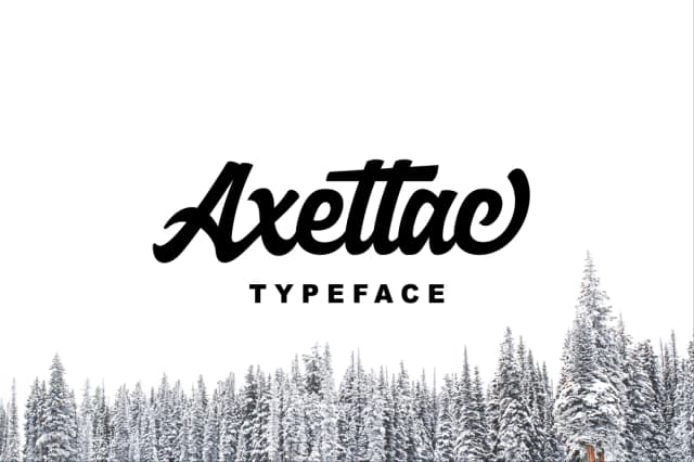
More Script Handwritten Fonts
Browse all →







What pairs well with Ematodas Font?
Ematodas Font is a script font that shines as a display or heading face. Pair it with a clean sans-serif or serif font for body text — the contrast creates a clear hierarchy while the two styles stay balanced and easy to read.



Ematodas Font
by Subqi Std
Reviewed by the FontBoxDL team · Updated May 2026