
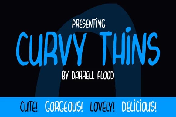
About Curvy Thins Font
Curvy Thins Font by Dadiomouse is a playful handwritten script with a bouncy, compact design that brings personality and movement to any project requiring expressive, character-driven letterforms. The freeform style authentically captures the warmth of hand-lettering while maintaining consistent readability across different sizes, making it an excellent choice for creative applications where visual charm and character matter as much as clarity.
This typeface truly excels in comic dialogue bubbles and animated character speech, where its curved letterforms add vitality and movement to cartoon storytelling. It works beautifully for hand-lettered greeting cards, children's picture book illustrations, playful social media graphics, and personalized DIY sticker designs. The genuine handwritten quality feels authentic without sacrificing legibility, whether you're lettering scrapbook journal entries, designing quirky packaging labels for small businesses, or creating charming illustrations for indie creative projects that need warmth and personality.
With its distinctive curvy letterforms and approachable personality, Curvy Thins Font brings genuine handmade warmth to digital designs. The bouncy letterforms work across various creative contexts, from casual digital communications to print-ready artwork. Find Curvy Thins Font on Creative Fabrica and discover how it can add character and personality to your next creative project.
Style & Use Cases
- Overall Style
- Elegant, Flowing, Curvy Thins
- Use Case
- Invitations, Branding
- Ideal For
- wedding stationery, greeting cards, and signatures
- Pairs With
- a simple uppercase sans
How to Install Curvy Thins Font Font
Step-by-step instructions for every platform
- 1Download the Curvy Thins Font font file (.ttf or .otf).
- 2Locate the downloaded file in your Downloads folder.
- 3Right-click the font file.
- 4Select "Install" to install for the current user, or "Install for all users" to make it available system-wide.
- 5Curvy Thins Font is now available in Word, Photoshop, Illustrator, and all other apps.
More by Dadiomouse
View all →
More Script Handwritten Fonts
Browse all →







What pairs well with Curvy Thins Font?
Curvy Thins Font is a script font that shines as a display or heading face. Pair it with a clean sans-serif or serif font for body text — the contrast creates a clear hierarchy while the two styles stay balanced and easy to read.



Curvy Thins Font
by Dadiomouse
Reviewed by the FontBoxDL team · Updated May 2026