 Firefox
 1 / 3
1 / 3About Circa Font
Circa by K-Type is a geometric display typeface drawn from the bold, rounded lettering that once graced vintage furniture advertisements on Paris Metro station walls. The design pulls inspiration from circles and clean structural lines, with a subtle Bauhaus influence running through the whole family. What distinguishes this face is its oversized x-height, a proportion that demands thoughtful spacing and careful leading from anyone who works with it. It's not a typeface for the timid: designers need to respect its visual weight and plan accordingly.
The geometric construction shines in record label branding, mid-century modern book covers, vintage event posters, and retro cosmetics packaging. Its bold proportions create visual presence that commands attention, transforming what could be a limitation into a genuine strength when used purposefully. The circular forms and assured stance evoke a specific historical moment while remaining surprisingly relevant when deployed with intention and confidence. You want this face where typography becomes a central design element rather than supporting player, where it actively shapes the personality of the work rather than serving as a neutral vessel for text.
Get Circa on Creative Fabrica and start exploring how its assertive geometry can reshape the feel and voice of your next project.
Style & Use Cases
- Overall Style
- Bold, Distinctive
- Use Case
- Headlines, Posters
- Ideal For
- logos, packaging, and standout titles
- Pairs With
- a neutral sans-serif
How to Install Circa Font
Step-by-step instructions for every platform
- 1Download the Circa font file (.ttf or .otf).
- 2Locate the downloaded file in your Downloads folder.
- 3Right-click the font file.
- 4Select "Install" to install for the current user, or "Install for all users" to make it available system-wide.
- 5Circa is now available in Word, Photoshop, Illustrator, and all other apps.


Browse fonts by theme
Curated collections →Saw a font in a picture? Identify any font from an image with our free Font Finder.
More Decorative Fonts
Browse all →


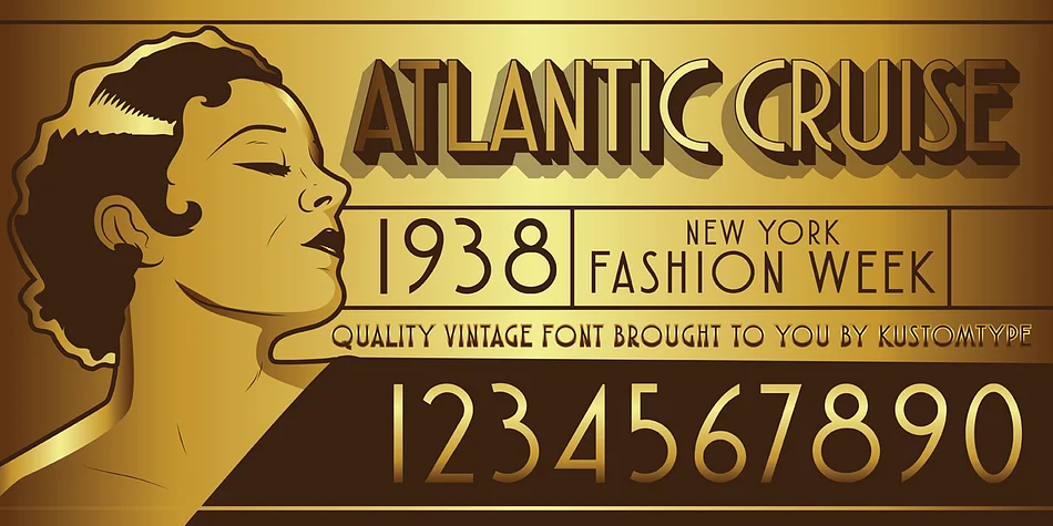
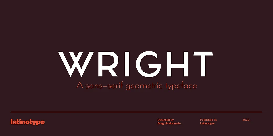
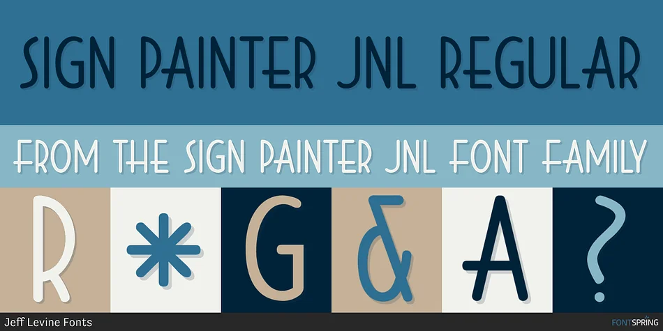
What pairs well with Circa Font?
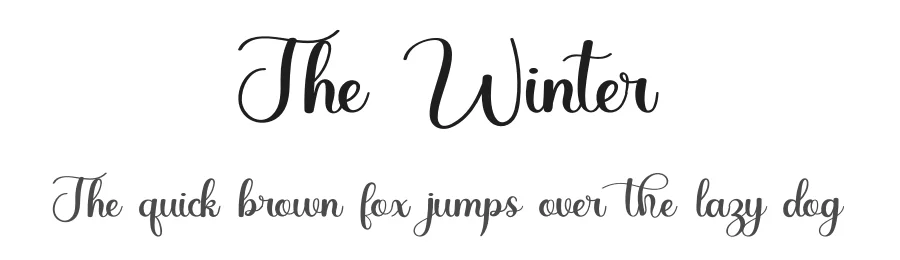
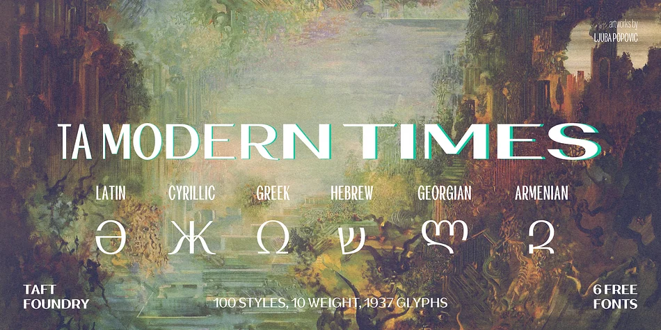
Circa Font is a decorative font that shines as a display or heading face. Pair it with a clean sans-serif or serif font for body text — the contrast creates a clear hierarchy while the two styles stay balanced and easy to read.




Circa Font
by K-Type
Reviewed by the FontBoxDL team · Updated June 2026