
 1 / 5
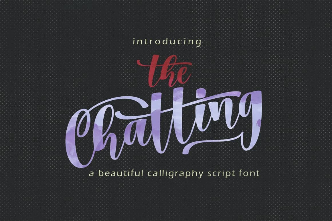
1 / 5About Chatting Font
Chatting Font by Meutuwah is a fluid, handwritten script designed to bring warmth and conversational charm to creative work. Its organic letterforms capture the authentic rhythm and personality of casual handwriting, creating a visual voice that feels genuinely personal and approachable rather than corporate or overly designed. This typeface excels for intimate applications where human connection matters. Wedding invitation suites gain immediate authenticity through its natural flow, while greeting cards and personalized thank you notes feel considerably more heartfelt. The font's friendly character makes it particularly effective for social media content where Instagram captions and story graphics benefit from a handwritten aesthetic. Event organizers appreciate it for birthday party invitations and casual announcements, and it works equally well for informal branding, coffee shop menus, artisan bakery signage, boutique product labels, and vendor packaging all feel more approachable with this typeface. Designers also choose it for DIY craft projects and hand-lettered poster designs that call for warmth and relatable character without pretension. Chatting Font delivers distinctive personality to any project requiring authentic visual storytelling. Get this charming script from Creative Fabrica and add its genuine handwritten voice to your next design.
Style & Use Cases
- Overall Style
- Elegant, Flowing, Chatting
- Use Case
- Invitations, Branding
- Ideal For
- wedding stationery, greeting cards, and signatures
- Pairs With
- a simple uppercase sans
How to Install Chatting Font Font
Step-by-step instructions for every platform
- 1Download the Chatting Font font file (.ttf or .otf).
- 2Locate the downloaded file in your Downloads folder.
- 3Right-click the font file.
- 4Select "Install" to install for the current user, or "Install for all users" to make it available system-wide.
- 5Chatting Font is now available in Word, Photoshop, Illustrator, and all other apps.
More by Meutuwah
View all →
More Script Handwritten Fonts
Browse all →







What pairs well with Chatting Font?
Chatting Font is a script font that shines as a display or heading face. Pair it with a clean sans-serif or serif font for body text — the contrast creates a clear hierarchy while the two styles stay balanced and easy to read.



Chatting Font
by Meutuwah
Reviewed by the FontBoxDL team · Updated May 2026