
 1 / 7
1 / 7About Chameleon Font
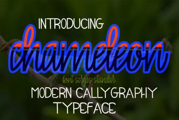
Chameleon Font by maydhen studio is a contemporary handwritten script that captures the fluidity of pen-on-paper lettering with a distinctly modern sensibility. The typeface showcases genuine handwriting characteristics, organic curves, natural rhythm, and authentic stroke variation, that bring personality to any application. Its approachable yet sophisticated letterforms work equally well in high-design contexts and intimate personal projects, making it a versatile choice for designers seeking genuine human warmth in their typography. The script excels in applications demanding character and authenticity. Wedding invitation suites benefit from its elegant-yet-casual aesthetic, while boutique product labels gain sophistication through its refined handwritten forms. Greeting card designs feel more personal with this typeface's natural flow, and social media graphics for lifestyle brands become more engaging when featuring its distinctive letterforms. The font's balanced approach, neither overly formal nor too playful, allows it to bridge traditional and contemporary design sensibilities with ease. Chameleon Font's natural handwritten quality translates particularly well across different media and sizes. Whether you're designing stationery, branding materials, or digital content, the typeface maintains its authenticity and legibility. Get Chameleon Font from Creative Fabrica and bring genuine handwritten elegance to your design work.
Style & Use Cases
- Overall Style
- Elegant, Flowing, Chameleon
- Use Case
- Invitations, Branding
- Ideal For
- wedding stationery, greeting cards, and signatures
- Pairs With
- a simple uppercase sans
How to Install Chameleon Font Font
Step-by-step instructions for every platform
- 1Download the Chameleon Font font file (.ttf or .otf).
- 2Locate the downloaded file in your Downloads folder.
- 3Right-click the font file.
- 4Select "Install" to install for the current user, or "Install for all users" to make it available system-wide.
- 5Chameleon Font is now available in Word, Photoshop, Illustrator, and all other apps.
More by maydhen studio
View all →
More Script Handwritten Fonts
Browse all →







What pairs well with Chameleon Font?
Chameleon Font is a script font that shines as a display or heading face. Pair it with a clean sans-serif or serif font for body text — the contrast creates a clear hierarchy while the two styles stay balanced and easy to read.



Chameleon Font
Reviewed by the FontBoxDL team · Updated May 2026