
 1 / 10
About BRASILEIRO Font
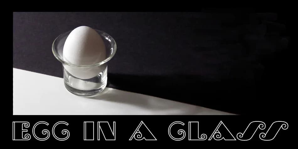
Picture a 1920s Brazilian nightclub poster with bold geometric letters that seem to dance across the page. That's the spirit of Brasileiro, the art deco display face from CastleType, which draws its energy from the iconic logotype of "Para Todos" magazine during Brazil's golden era. This typeface channels that period's exuberance and playful confidence, the kind of letterforms that make people stop and look twice.
Brasileiro excels at decorative projects that demand character and vintage soul. Speakeasy invitation suites gain instant authenticity from its geometric boldness, while art deco wedding stationery benefits from an unexpected global flair. Set it as a cocktail menu header and watch it become the focal point, or use it on vintage record label designs where the typeface practically comes alive. Luxury cosmetics packaging that wants to feel both historic and vibrant finds its perfect voice here, as do gallery exhibition posters and retro nightclub signage where drama matters most. Even boutique fashion brand headers and vintage travel poster designs sing under its influence.
The letterforms maintain strong legibility at large display sizes despite their ornamental nature. Grab Brasileiro from Creative Fabrica and bring 1920s Brazilian spirit into your next design.
Style & Use Cases
- Overall Style
- Bold, Distinctive
- Use Case
- Headlines, Posters
- Ideal For
- logos, packaging, and standout titles
- Pairs With
- a neutral sans-serif
How to Install BRASILEIRO Font
Step-by-step instructions for every platform
- 1Download the BRASILEIRO font file (.ttf or .otf).
- 2Locate the downloaded file in your Downloads folder.
- 3Right-click the font file.
- 4Select "Install" to install for the current user, or "Install for all users" to make it available system-wide.
- 5BRASILEIRO is now available in Word, Photoshop, Illustrator, and all other apps.
More by CastleType
View all →



More Decorative Fonts
Browse all →






What pairs well with BRASILEIRO Font?
BRASILEIRO Font is a decorative font that shines as a display or heading face. Pair it with a clean sans-serif or serif font for body text — the contrast creates a clear hierarchy while the two styles stay balanced and easy to read.



BRASILEIRO Font
by CastleType
Reviewed by the FontBoxDL team · Updated June 2026