
 1 / 8
1 / 8About Aluria Font
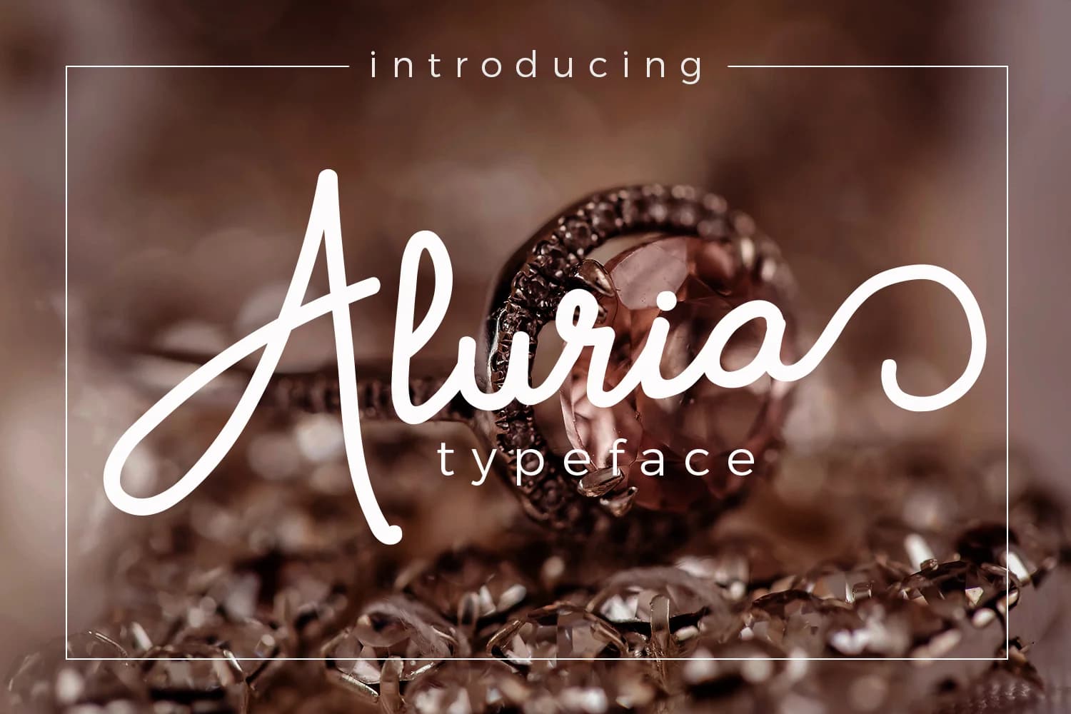
Aluria by josgandos is a handwritten script font that captures the fluid grace of authentic penmanship while maintaining exceptional clarity in every character. With its clean letterforms and sophisticated readability, this typeface works beautifully across a wide range of design applications where personality and professionalism must coexist. This font excels in elegant branding projects that demand a personal touch, wedding invitation suites, luxury stationery collections, and upscale social media graphics for creative professionals. Its balanced letterforms make it equally effective for modern calligraphy compositions, hand-drawn logo designs, and custom journal covers that require a polished yet intimate aesthetic. The typeface's versatility extends to artisanal product packaging, boutique brand identities, and premium event materials designed to convey authenticity and refined taste. Whether you're developing a luxury business card suite, creating cohesive branded collateral, or building a complete visual identity that speaks to discerning audiences, Aluria delivers the handwritten warmth your projects need without sacrificing professional legibility. The font's balanced weight and consistent strokes ensure readability across both digital and print applications. Get Aluria on Creative Fabrica and bring sophisticated character to your next design.
Style & Use Cases
- Overall Style
- Elegant, Flowing, Aluria
- Use Case
- Invitations, Branding
- Ideal For
- wedding stationery, greeting cards, and signatures
- Pairs With
- a simple uppercase sans
How to Install Aluria Font Font
Step-by-step instructions for every platform
- 1Download the Aluria Font font file (.ttf or .otf).
- 2Locate the downloaded file in your Downloads folder.
- 3Right-click the font file.
- 4Select "Install" to install for the current user, or "Install for all users" to make it available system-wide.
- 5Aluria Font is now available in Word, Photoshop, Illustrator, and all other apps.
More by josgandos
View all →
More Script Handwritten Fonts
Browse all →







What pairs well with Aluria Font?
Aluria Font is a script font that shines as a display or heading face. Pair it with a clean sans-serif or serif font for body text — the contrast creates a clear hierarchy while the two styles stay balanced and easy to read.



Aluria Font
by josgandos
Reviewed by the FontBoxDL team · Updated May 2026