Firefox
Updated October 11, 2026: six worked examples with the actual results, a 12-image comparison against other free identifiers, and the Firefox add-on alongside the Chrome extension.
Last year a reader emailed us a photo of a wedding invitation from 2019. Her sister was getting married and wanted the exact same lettering. No designer to ask, no files left, just a slightly blurry photo taken at the reception. She had spent two evenings scrolling font sites hoping to spot it.
This happens constantly. A client sends a flattened JPEG of their old logo. You screenshot a poster on Pinterest. You inherit a brand guide that names a font nobody can find. The text is right there in front of you, but the name is gone.
The good news: this is a solved problem now, and you don't need to pay for it or create an account anywhere. Here is the process we recommend, the results on six real-world images so you know what to expect, and the small things that decide whether you get a perfect match or a page of almost-rights.
The one-minute version
Go to our Font Finder by Image, upload your picture, crop it to the clearest line of text, and hit identify. You get the closest matches from an index of more than 260,000 fonts, each with a live preview so you can compare shapes side by side, and each linking to a free download or to the original source. If the font is in the index, it is usually sitting in the first row. If you would rather not leave the page you are on, the Chrome extension and the Firefox add-on do the same thing from the right-click menu; more on those below.
Full disclosure: we built this tool, so of course we recommend it first. But we built it because we kept doing the manual version of this search ourselves and hated it. Under the hood it does not match filenames or metadata. It looks at the actual letterforms in your image and compares their shapes against rendered samples of every font we index, using a model trained specifically to tell typefaces apart. That is why it works on photos, screenshots and logos where there is no text data at all.
Six real examples, with the actual results
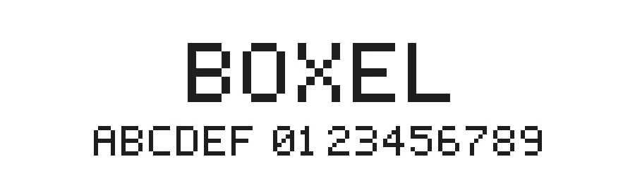
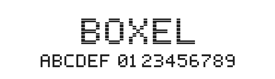
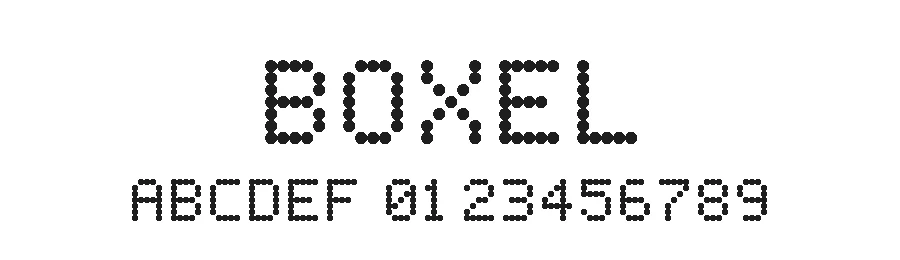
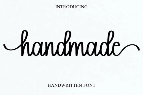
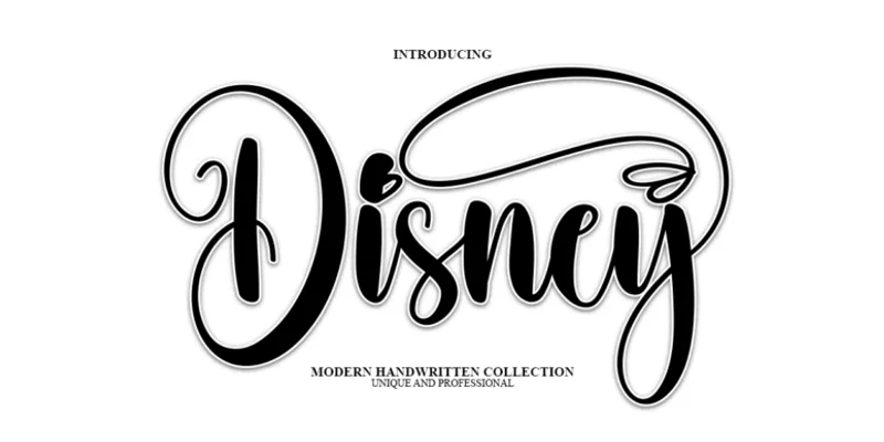
Talk is cheap, so here are six images of the kind people upload every day, made with fonts whose names we know, and exactly what the identifier returned for each. Nothing was cropped or retouched unless the caption says so.
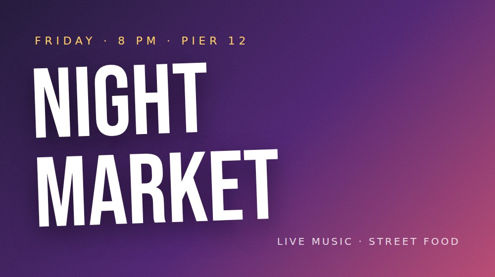
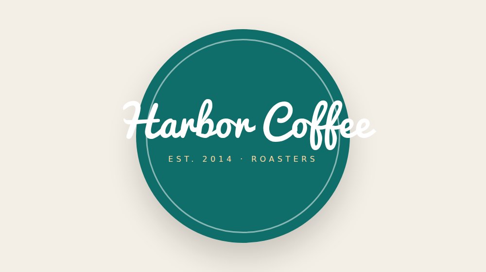
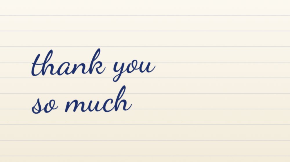
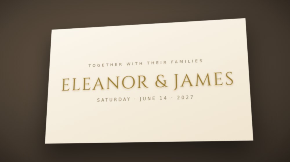
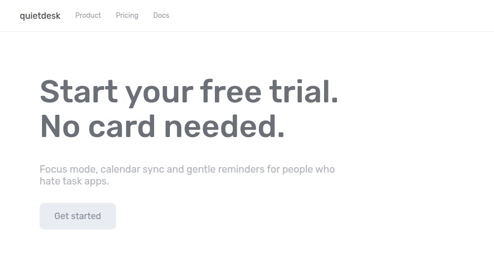
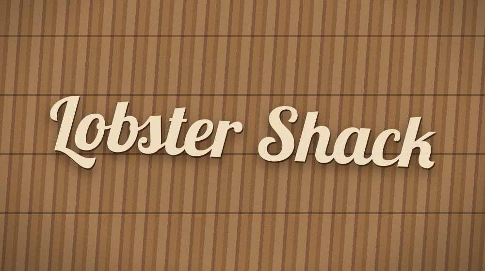
One thing you will notice if you run these yourself: on all six, the tool labelled the result "not sure, closest look-alikes" even when the first row was correct. The confidence label is deliberately cautious, and right now it is too cautious; we are recalibrating it on real uploads. Until then, read the list and the previews, not the label.
How to get a match on the first try
We have watched a lot of uploads fail for the same three reasons, and none of them are the tool's fault. Font identification is a garbage-in, garbage-out business. Five rules cover almost everything:
- Crop to the text, but keep every letter you have. Don't upload the whole poster with the photo and the borders; crop to the lettering. But as example 5 shows, if the text itself is clean, two lines beat one word. More distinct letters, less background.
- Straighten it. A photo taken at an angle warps every letter. If the text runs uphill, rotate the image first. Even five degrees of tilt measurably hurts the results, and examples 4 and 6 would both have scored higher straightened.
- Contrast matters more than resolution. A small but crisp black-on-white screenshot beats a huge photo of gold foil letters on a marble table. If you can, bump the contrast before uploading. Light text on a dark background is fine; the tool inverts it for you.
- Pick the most distinctive word. A word with a lowercase a, g, e or r gives the matcher far more to work with than "III" or "HELLO" in flat capitals.
- One font at a time. Invitations love pairing a swirly script with a small-caps sans. Crop them separately and run two searches. Mixed lettering in one crop confuses any identifier, ours included.
When we tested the tool before launch, the difference between a lazy full-photo upload and a tight, straightened crop was the difference between one correct match in eight and seven in eight. Same photos, same fonts. The crop did all the work.
How it compares: the same 12 images, five identifiers
We get asked this a lot, so in October 2026 we ran the same 12 test images through every free identifier we could use from a browser without an account. Four images were clean renders; eight were made to look like real uploads: textured or gradient backgrounds, a few degrees of rotation, perspective, slight blur, low contrast, a dark background, heavy JPEG compression, and sizes down to 360 pixels wide. All 12 fonts were free fonts from Google Fonts. Score is where the true font appeared in the top five.
| Identifier | Correct at #1 | In top 5 | Notes |
|---|---|---|---|
| FontBoxDL Font Finder | 9 of 12 | 12 of 12 | Misses were scripts on texture (Lobster at #4) and a thin sans at 360 px (Raleway at #3). |
| WhatFontIs | 6 of 12 | 10 of 12 | Five-step flow with letter confirmation; strong when its OCR reads the letters right, collapsed on the small dark JPEG. Free tier is five searches a day. |
| Font Squirrel Matcherator | 5 of 6 | 5 of 6 | Only six images could be tested before it stopped serving the page. Good on what it saw; its own help warns it is weak on scripts. |
| WhatTheFont (MyFonts) | 0 of 12 | 0 of 12 | Not a fair fight on free fonts: its catalog is commercial, so it structurally cannot name a Google Font. Its paid look-alike suggestions were sensible. |
| Open-source identifier model (ResNet18, about 1,000 families) | 7 of 12 | 9 of 12 | Strong on the photo-like images, missed three of the four clean renders. Licence forbids commercial use. |
Treat this as "the approach works", not as a league table: it is our test, on our images, and every one of these tools has a different catalog. The practical takeaway is in the notes column. If your font might be commercial, WhatTheFont is worth a second search. If it might be free, start here.
Reading the results like a designer
Sometimes the top result is your font, the previews line up perfectly, and you are done. Enjoy it. The more interesting case is when the first three rows look alike.
Don't just read the names; compare the skeletons. Look at the letters that fonts can't hide behind: the lowercase g (one storey or two?), the a (single or double bowl?), the tail of the y, the bar of the e (horizontal or slanted?), and any ampersand if you are lucky enough to have one. Two script fonts can look like twins at a glance and then completely disagree on the letter k.
Script fonts are genuinely the hardest category, because half of them chase the same handful of trends. A casual brush style like Fast Kick has dozens of siblings that only differ in their connecting strokes. Softer scripts like Sweet Whisper and Mochaberry get mistaken for each other constantly, until you look at how the descenders loop. That is where the side-by-side previews earn their keep.
And here is an unpopular opinion from someone who has done a lot of these searches: sometimes the second-best match is the better choice. If the exact font turns out to be a paid family from 2011 with no licence for web use, and the number two result is a free font with 95% of the same personality, take the free one and move on with your life. Nobody at the wedding is checking terminals with a loupe.
When no tool can find it
It happens, and it is worth knowing why, because the reason tells you what to do next.
- It might not be a font at all. A lot of logo lettering and wedding calligraphy is custom hand-lettering, drawn once, for that client. There is no font file to find. The tell: letters that repeat in the text but don't look identical. Two different lowercase e shapes in one word means a human drew it.
- It might be modified. Brands routinely start from a real font and then customise a few letters. You will find the base font, but the quirky R in the logo won't match anything.
- The photo might be beyond saving. Heavy distressing, neon glow, extreme perspective. Try to find another photo of the same text before giving up.
If you are stuck, run the image through a second identifier (WhatTheFont is the veteran for commercial fonts, and different catalogs surface different matches), and if that fails too, the r/identifythisfont community on Reddit solves absurdly hard cases daily. Post the image, mention where you saw it, and someone with encyclopedic font memory usually appears within hours.
Found it? Two things before you use it
First, check the licence. Identifying a font tells you what it is, not what you are allowed to do with it. Plenty of free-to-download fonts are personal-use only, which covers your party invitation but not your client's packaging. Every font page on our site states the licence up front, so you know before you have fallen in love. Fonts like Le Jour Serif or Qestero spell out exactly what is permitted; read that part.
Second, install it properly. We wrote a full walkthrough for every platform in our font installation guide. And if the font is heading to a website rather than a Cricut mat, convert it to WOFF2 with the webfont generator first; your page speed will thank you (here is why WOFF2 matters).
The one-click version: the Chrome extension and the Firefox add-on
Everything above still applies, but there is a shortcut. The FontBoxDL Font Finder extension for Chrome (it also installs on Edge, Opera and Brave) puts the identifier in your right-click menu: on any website, right-click the image with the lettering, choose Identify font in this image, and the closest matches appear in a small panel on the page, each linking to a free download or the original source. The same extension is now available as a Firefox add-on.
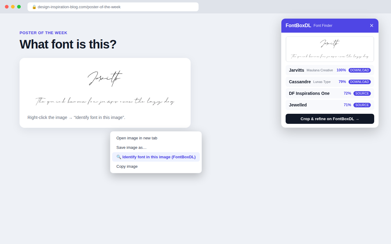
The October 2026 update added the things we kept opening other tools for. A hover inspector (Alt+Shift+F) shows the font that is actually rendering a piece of text, not just the first name in the CSS stack, with its size, weight, line height and colour, and tells you whether it is a hosted web font or a system font. A "fonts on this page" list (Alt+Shift+L) shows every family a site uses, with element counts and a live sample. You can type your own text in any of them, save the ones you like in your browser, or copy the CSS.
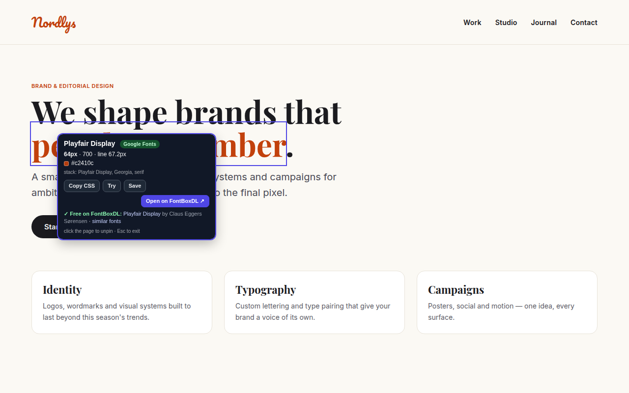
Two details matter. First, it is honest about uncertainty: when the candidates are visually close it says so instead of showing a fake 99%, and you can jump to the full tool to crop just the lettering. Second, it reads nothing from a page until you act; the image URL is sent to our server only when you click the menu item, and the extension asks for no broad site permissions. It is free, needs no account, and uses the same 260,000-font index as the web tool. Add it to Chrome or get it for Firefox.
A faster habit for next time
The real upgrade is not any single search; it is changing the reflex. Screenshot the font you like the moment you see it, while it is big and clean on your screen, instead of hunting for the image again three weeks later. A folder of font screenshots plus an identifier is basically a personal font memory. With the extension installed, you don't even need the folder.
And if you are collecting for a specific project, browsing a curated set beats identifying fonts one by one. Our wedding fonts collection and aesthetic fonts collection exist precisely because the same styles get identified over and over; the crowd has already found them for you.
The reader with the wedding invitation, by the way, found her font on the second crop. It took her longer to email us a thank-you than it took to identify it. That is the bar now: if you have spent more than five minutes wondering what a font is, you are doing it the old way.
Frequently asked questions
Can it identify handwriting or a hand-lettered logo?
Only if it is a font. Real handwriting and custom lettering have no font file, so no identifier can "find" them. What the tool will give you is the closest fonts in the same style, which is usually what you need anyway: something you can type with that looks like the sample.
Does it work on photos taken with a phone?
Yes, as examples 4 and 6 show, with two caveats. Straighten the photo if the text is at an angle, and crop to the lettering so the model is not looking at the table and the plant. Light text on a dark background is handled automatically.
Is it really free? Do I need an account?
Free, no account, no daily limit, on the web tool and in both browser extensions. The matches link to free downloads where the font is free, and to the original source where it is not.