Firefox
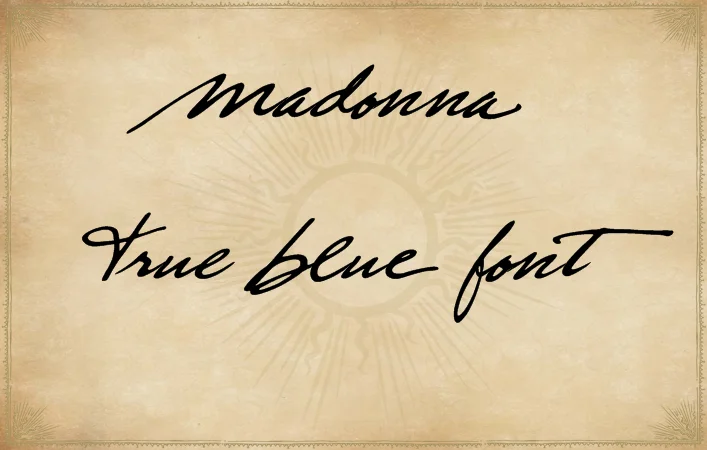
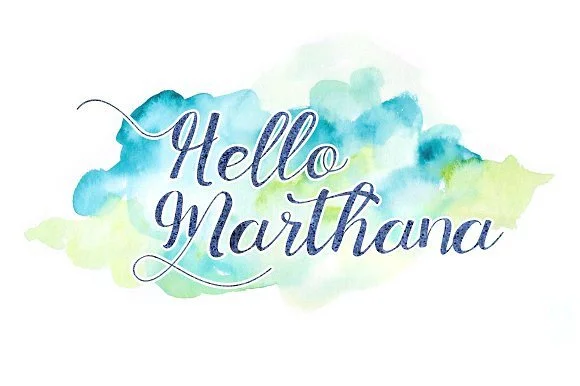
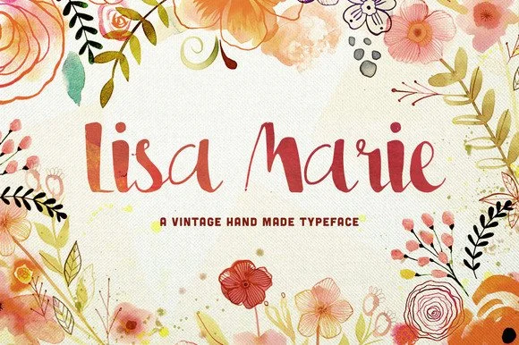
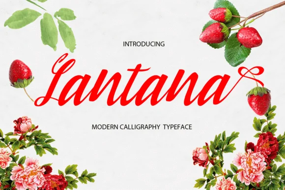
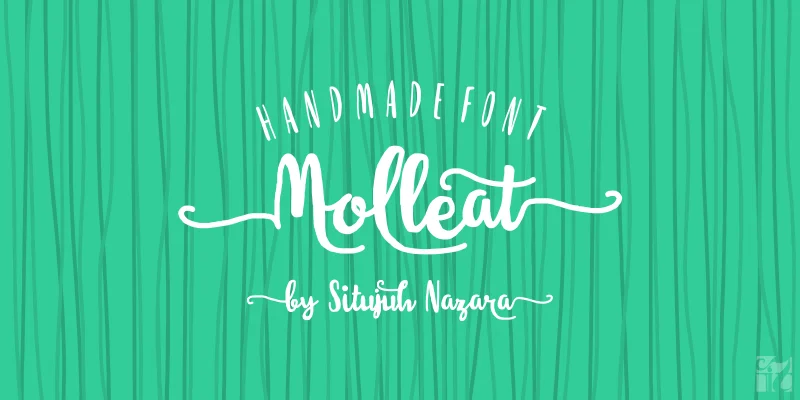
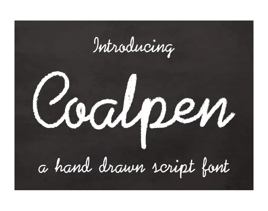
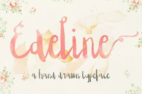
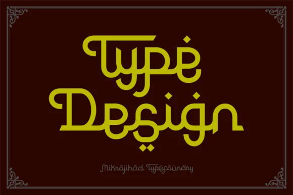
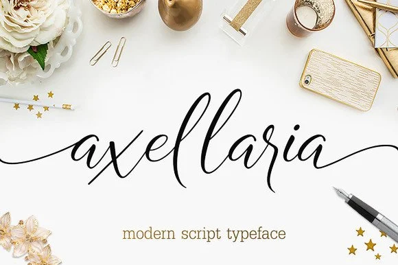
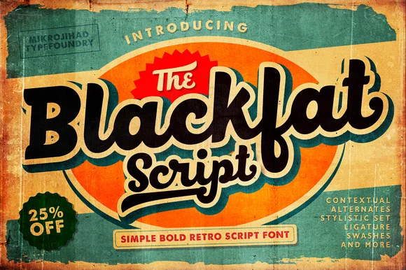
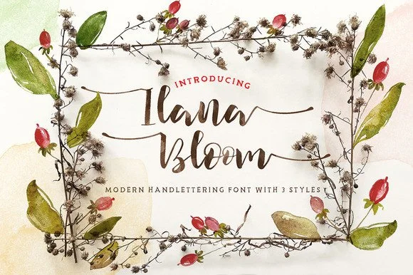
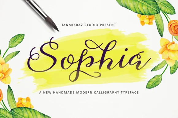
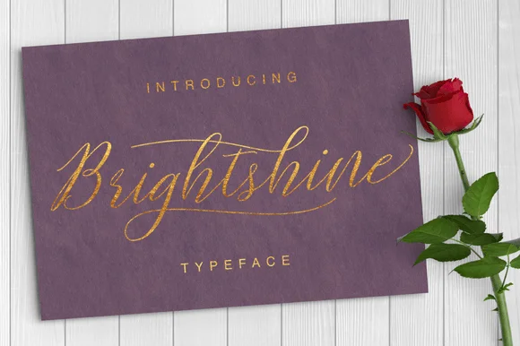
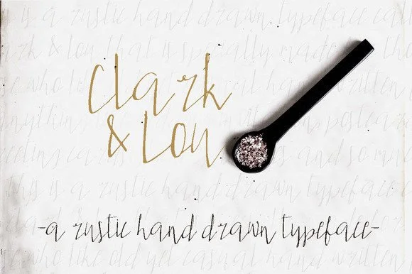
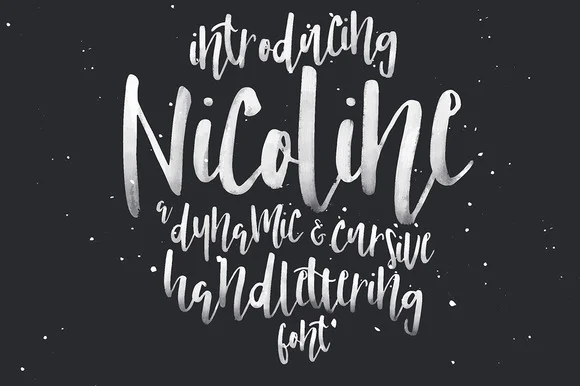
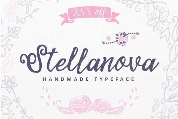
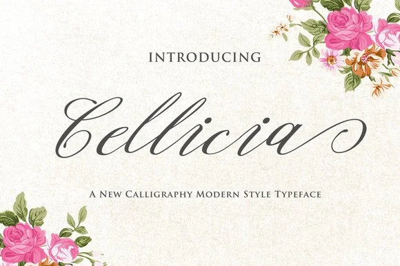
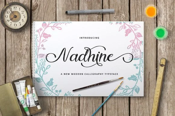
What makes a font "aesthetic"?
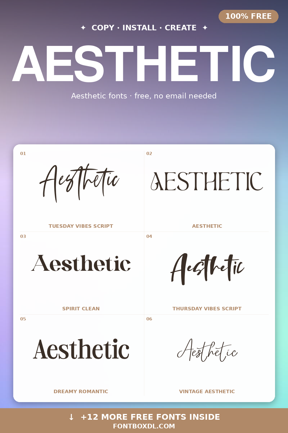
The term is loose, but most aesthetic fonts share a few traits: even letter spacing, restrained contrast between thick and thin strokes, lowercase letters that feel softer than their uppercase counterparts, and an overall sense of calm. They tend to look at home next to off-white backgrounds, muted earth tones, and lots of negative space.
Best use cases
- Canva templates for Instagram, Pinterest, and Reels covers
- Personal branding for coaches, photographers, and creatives
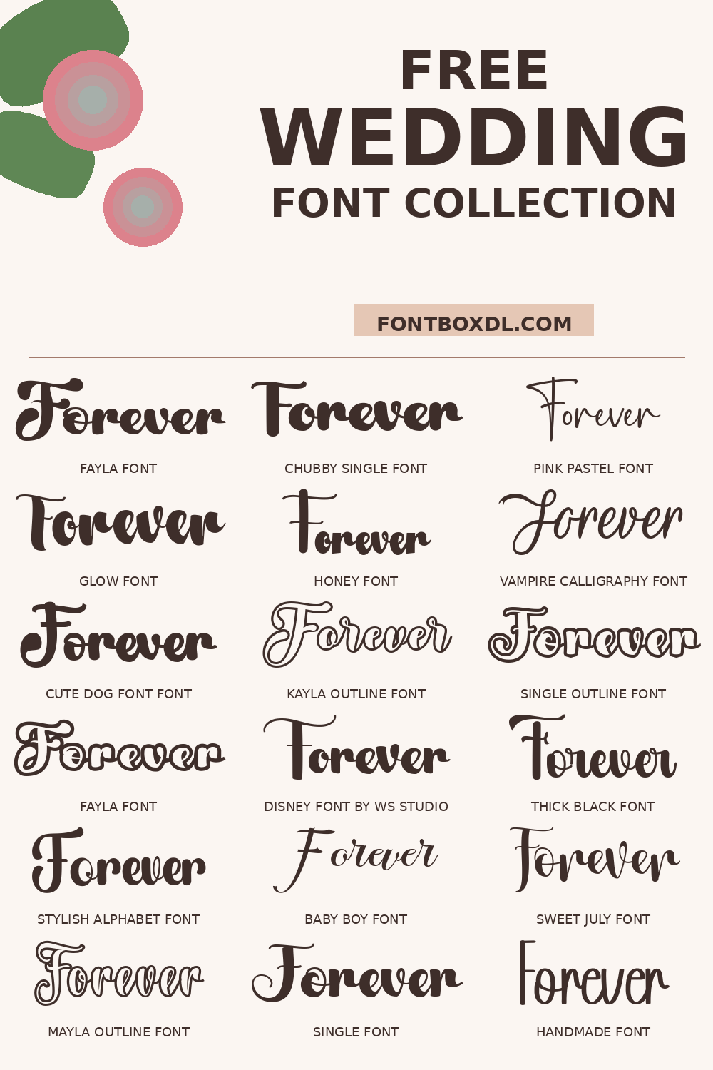
- Wedding stationery — invitations, save the dates, table cards
- Skincare, candle, and slow-fashion product packaging
- Mood boards, mission statements, and quiet hero sections on portfolio sites
Building an aesthetic font system
A complete aesthetic typography system usually combines three voices: a thin or light sans-serif for navigation and small UI text, a refined modern serif for headlines, and a script or hand-lettered accent for personal touches like signatures or quotes. Keep your palette to three or four colors max — beige, sage, dusty rose, and soft black are the most common starting points. Let line-height breathe; a 1.6–1.8x leading on body text is part of what gives the style its airy feeling.
Common pitfalls
Aesthetic fonts can drift into illegible territory if the script is too curly or the contrast too low. Always preview your text against your final background color at the real device size. For Canva users: if a font looks great on the desktop preview but mushy on mobile, the strokes are likely too thin for small screens — choose a heavier weight or scale up the type size.
License and credit
Every font in this collection links to its original creator's license terms. Many are free for personal projects; commercial licensing is generally available from the designer. We recommend reading the license carefully if you're using a typeface for client work, paid templates, or merchandise.