 Firefox
 1 / 10
About Rahila Arabic Font
Rahila Arabic's letterforms carry the flowing elegance of traditional calligraphy while standing confidently in contemporary design. Created by Afkari Studio, this decorative typeface captures the expressive rhythm and character that makes Arabic script distinctively powerful. The design bridges cultural authenticity with modern usability, working cleanly across digital and print mediums without sacrificing the intricate visual personality that draws viewers in.
This typeface finds its strength in contexts where cultural presence genuinely matters to the work. Wedding invitation suites with bilingual layouts benefit enormously from its decorative weight and expressiveness, as do luxury cosmetics and fragrance packaging projects that demand visual sophistication. Restaurant menu design becomes more compelling when set in its flowing letterforms, and heritage-focused brands deploy it effectively across social media graphics and storefront signage. The font includes alternates and ligatures for refined typographic control, while its extended language support handles multilingual projects that pair Arabic with Latin characters across different scripts.
Designers working on personal brands, boutique businesses, galleries, and cultural organizations will find Rahila Arabic works for both classical and contemporary briefs. The typeface brings visual authenticity without feeling forced or overly ornamental. Find it on Creative Fabrica to add decorative Arabic typography to your toolkit.
Style & Use Cases
- Overall Style
- Bold, Distinctive
- Use Case
- Headlines, Posters
- Ideal For
- logos, packaging, and standout titles
- Pairs With
- a neutral sans-serif
How to Install Rahila Arabic Font
Step-by-step instructions for every platform
- 1Download the Rahila Arabic font file (.ttf or .otf).
- 2Locate the downloaded file in your Downloads folder.
- 3Right-click the font file.
- 4Select "Install" to install for the current user, or "Install for all users" to make it available system-wide.
- 5Rahila Arabic is now available in Word, Photoshop, Illustrator, and all other apps.
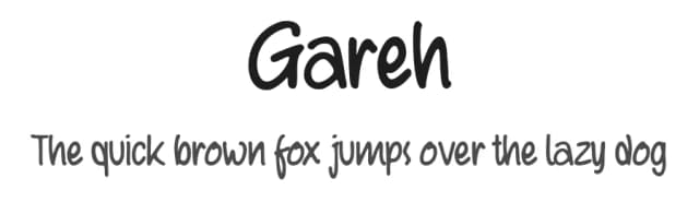
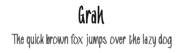
More by Afkari Studio
View all →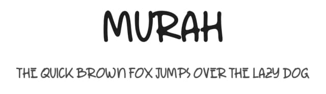

Browse fonts by theme
Curated collections →Saw a font in a picture? Identify any font from an image with our free Font Finder.
More Decorative Fonts
Browse all →







What pairs well with Rahila Arabic Font?
Rahila Arabic Font is a decorative font that shines as a display or heading face. Pair it with a clean sans-serif or serif font for body text — the contrast creates a clear hierarchy while the two styles stay balanced and easy to read.



Rahila Arabic Font
Reviewed by the FontBoxDL team · Updated June 2026