 Firefox

 1 / 3
Loading font…
About Oxford Street Font
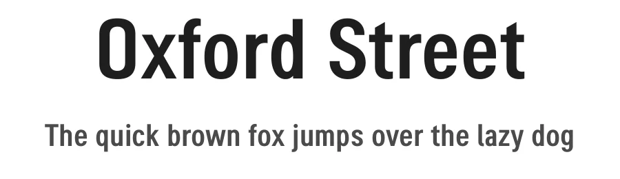
K-Type Oxford Street is a signage font that began as a redrawing of the capital letters used for street nameplates in the borough of Westminster in Central London.
The nameplates were designed in 1967 by the Design Research Unit using custom lettering based on Adrian Frutigers Univers typeface, a curious combination of Univers 69 Bold Ultra Condensed, a weight that doesnt seem to exist but which would flatten the long curves of glyphs such as O, C and D, and Universe 67 Bold Condensed with its more rounded lobes on glyphs like B, P and R.
Letters were then remodelled to improve their use on street signs. Thin strokes like the inner diagonals of M and N were thickened to create a more monolinear alphabet; the high interior apexes were lowered and the wide joins thinned. The crossbar of the A was lowered, the K was made double junction, and the tail of the Q was given a baseline curve.
K-Type Oxford Street continues the process of impertinent improvement and includes myriad minor adjustments and several more conspicuous amendments. The stroke junctions of M and N are further narrowed and their interior apexes modified. The middle apex of the W is narrowed and the glyph is a little more condensed. The C and S are drawn more open, terminals slightly shortened.
The K-Type font adds a new lowercase which is also made more monolinear so better suited to signage, loosely based on Univers but also taking inspiration from the Transport typeface both in a taller x-height and character formation. The lowercase L has a curled foot, the k is double junctioned to match the uppercase, and terminals of a, c, e, g and s are drawn shorter for openness and clarity.
A full repertoire of Latin Extended-A characters features low-rise diacritics that keep congestion to a minimum in multiple lines of text.
More...
The font tips the hat to signage history by including stylistic alternates for M, W and w that have the pointed middles of the earlier MOT street sign typeface.
Full details at
https://www.k-type.com/fonts/oxford-street/
Style & Use Cases
- Overall Style
- Clean, Modern, Basic
- Use Case
- Body Text, UI
- Ideal For
- branding, interfaces, and modern layouts
- Pairs With
- a contrasting serif for headings
How to Install Oxford Street Font
Step-by-step instructions for every platform
- 1Download the Oxford Street font file (.ttf or .otf).
- 2Locate the downloaded file in your Downloads folder.
- 3Right-click the font file.
- 4Select "Install" to install for the current user, or "Install for all users" to make it available system-wide.
- 5Oxford Street is now available in Word, Photoshop, Illustrator, and all other apps.


Browse fonts by theme
Curated collections →Saw a font in a picture? Identify any font from an image with our free Font Finder.
More Sans Serif Fonts
Browse all →
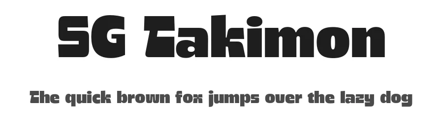

What pairs well with Oxford Street Font?
Oxford Street Font is a versatile sans-serif font that works for both headings and body text. Pair it with a contrasting serif or slab serif font to add visual interest and a clear distinction between titles and body copy.
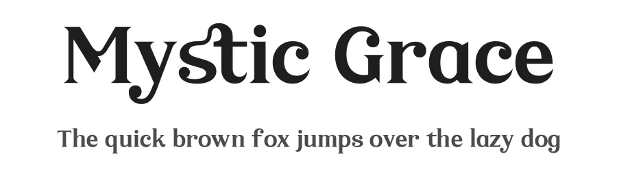
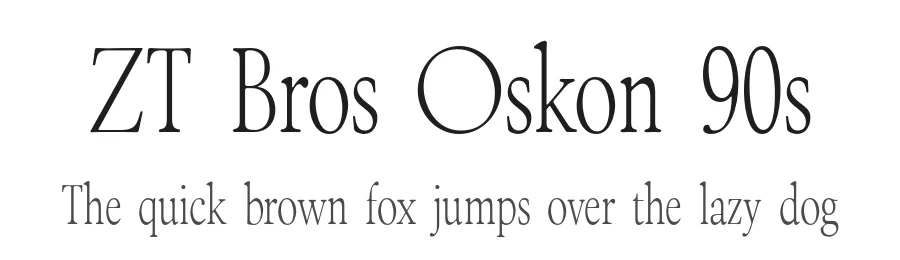
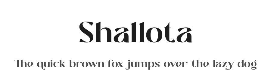
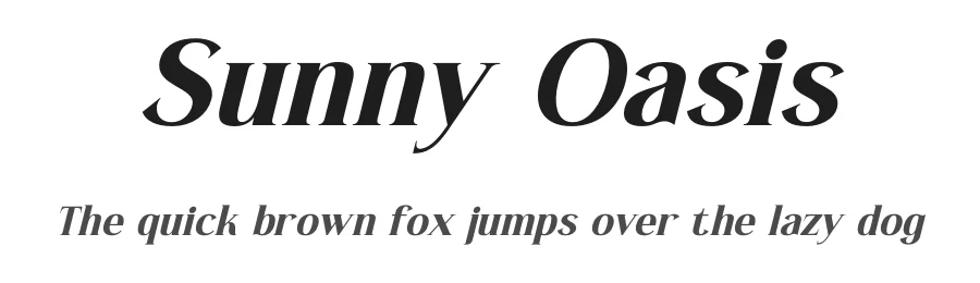
Premium Sans Serif Fonts
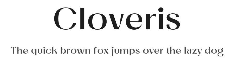
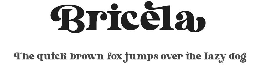
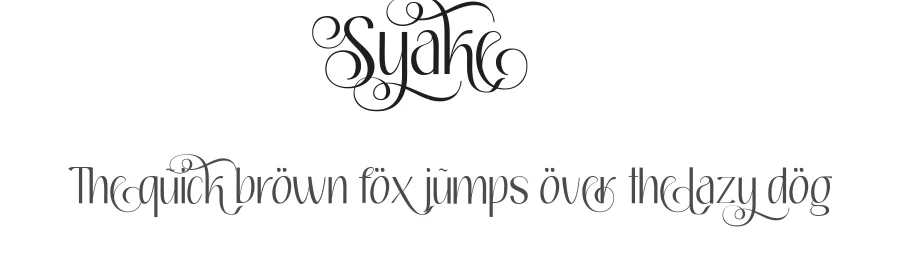
★ PremiumWant something with more weights, glyphs, and commercial polish? These premium sans serif fonts are worth a look.

Oxford Street Font
by K-Type
Reviewed by the FontBoxDL team · Updated October 2026
License: Free for personal use