Firefox
 1 / 3
1 / 3Loading font…
About Metropolian Font
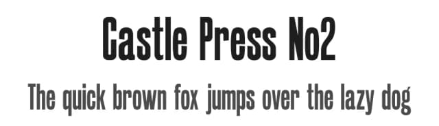
Id been looking for a project and came upon a type face called Metropolis, in a 1897 American Type Founders, New York specimen book.
Metropolian is my revival of Metropolis.
It is provided in two weights. Display for use at larger sizes and the slightly weightier Text for smaller sizes and body copy. Body copy set in Display looks a bit spider crawled across the page so I made the Text version to make the project more usable.
Metropolian is served free for personal use and as is, but I would encourage anyone downloading and using it to consider a modest donation to the buy the author a beer fund using the donate button on the right of this page. For use in commercial projects, a donation should be considered mandatory and not making one will induce seriously bad Karma.
Hope you enjoy using it as much as I enjoyed bringing it back to life.
(Note: Im still new to font making, so comments and suggestions for improvements are most welcome and will be heeded. ;-) . Thanks once again to the mods and staff of Dafont for their time and patience without which this wouldnt have been possible.)
Update with a more complete glyph set and improved metrics.
Pil
Style & Use Cases
- Overall Style
- Bold, Distinctive, Fancy
- Use Case
- Headlines, Posters
- Ideal For
- logos, packaging, and standout titles
- Pairs With
- a neutral sans-serif
Similar Fonts
Fonts that look visually alike — matched by our Font Finder model.


Metropolian Specifications
| Font Family | Metropolian |
| Style | Display |
| Full Name | Metropolian |
| Version | 001.000 |
| Weight | 400 (Regular) |
| Glyph Count | 247 glyphs |
| PostScript Name | Metropolian-Display |
| Format | OTF (CFF) |
| File Size | 172.4 KB |
Languages Supported
Metropolian supports 216 languages.
How to Install Metropolian Font
Step-by-step instructions for every platform
- 1Download the Metropolian font file (.ttf or .otf).
- 2Locate the downloaded file in your Downloads folder.
- 3Right-click the font file.
- 4Select "Install" to install for the current user, or "Install for all users" to make it available system-wide.
- 5Metropolian is now available in Word, Photoshop, Illustrator, and all other apps.
More by Pilaster Davy
View all →
Browse fonts by theme
Curated collections →Saw a font in a picture? Identify any font from an image with our free Font Finder.
More Decorative Fonts
Browse all →







What pairs well with Metropolian Font?
Metropolian Font is a decorative font that shines as a display or heading face. Pair it with a clean sans-serif or serif font for body text — the contrast creates a clear hierarchy while the two styles stay balanced and easy to read.



Premium Decorative Fonts
★ PremiumWant something with more weights, glyphs, and commercial polish? These premium decorative fonts are worth a look.