 Firefox
 1 / 10
About Decola Font
A dynamic dual-line structure defines this decorative typeface, where paired strokes create both elegance and movement at once. Decola, designed by Alit Design, draws from Art Deco principles without being a simple pastiche; the letterforms balance vintage roots with genuine utility in contemporary layouts.
What stands out beyond aesthetics is the breadth of character support: 710 glyphs, extensive alternates, and swashes that give you real control over the final look without forcing you to hunt through menus or compromise your vision. Ligatures are built in, PUA Unicode makes character access straightforward across different design software, and the font covers multiple languages. The technical foundation is solid enough that you can focus entirely on the design rather than troubleshooting compatibility.
This typeface belongs on projects where visual authority matters and restraint isn't the goal. Wedding invitation suites, luxury beauty packaging, editorial magazine covers, and high-end event signage all showcase what Decola can deliver. Designers working in branding, print editorial, or premium packaging will find genuine utility in the font's depth and customization options. The range of available characters and styles means you can push the letterforms in different directions depending on the project. Find it on Creative Fabrica when you're ready to add it to your kit.
Style & Use Cases
- Overall Style
- Bold, Distinctive
- Use Case
- Headlines, Posters
- Ideal For
- logos, packaging, and standout titles
- Pairs With
- a neutral sans-serif
How to Install Decola Font
Step-by-step instructions for every platform
- 1Download the Decola font file (.ttf or .otf).
- 2Locate the downloaded file in your Downloads folder.
- 3Right-click the font file.
- 4Select "Install" to install for the current user, or "Install for all users" to make it available system-wide.
- 5Decola is now available in Word, Photoshop, Illustrator, and all other apps.
More by Alit Design
View all →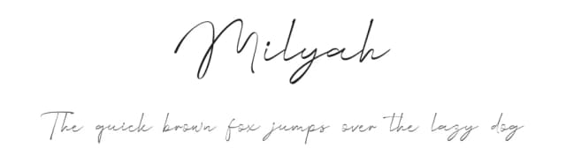
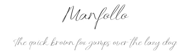
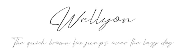
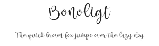
Browse fonts by theme
Curated collections →Saw a font in a picture? Identify any font from an image with our free Font Finder.
More Decorative Fonts
Browse all →







What pairs well with Decola Font?
Decola Font is a decorative font that shines as a display or heading face. Pair it with a clean sans-serif or serif font for body text — the contrast creates a clear hierarchy while the two styles stay balanced and easy to read.



Decola Font
by Alit Design
Reviewed by the FontBoxDL team · Updated June 2026