 Firefox
 1 / 6
1 / 6About CS Harmony Font
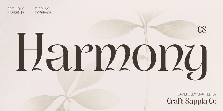
This font breathes with quiet elegance, the kind that makes any layout immediately feel intentional and carefully measured. CS Harmony, created by Craft Supply Co., translates classical Uncial letterforms into a contemporary display typeface where flowing curves and serif weight merge without tension or visual conflict.
Wedding invitation suites are natural homes for this typeface, particularly when you're aiming for sophistication over visual noise. The same rounded, distinctly calligraphic letterforms work beautifully across luxury skincare packaging, boutique perfume labels, high-end restaurant menus, and upscale event announcements. Formal branding projects that prioritize refinement and genuine staying power gain real character from its presence. The serif elements provide weight and visual authority while the flowing, gentle construction keeps everything feeling graceful and approachable rather than cold or architectural. It performs equally well when printed large or sized for digital headlines, scaling without losing its personality.
Pair it with a straightforward sans-serif typeface for body text, letting CS Harmony lead the visual identity at headline and display sizes. This combination creates clear visual hierarchy while keeping the overall sophistication intact and readable. It's available now on Creative Fabrica whenever you're ready to use it in your next project.
Style & Use Cases
- Overall Style
- Bold, Distinctive
- Use Case
- Headlines, Posters
- Ideal For
- logos, packaging, and standout titles
- Pairs With
- a neutral sans-serif
How to Install CS Harmony Font
Step-by-step instructions for every platform
- 1Download the CS Harmony font file (.ttf or .otf).
- 2Locate the downloaded file in your Downloads folder.
- 3Right-click the font file.
- 4Select "Install" to install for the current user, or "Install for all users" to make it available system-wide.
- 5CS Harmony is now available in Word, Photoshop, Illustrator, and all other apps.
More by Craft Supply Co.
View all →


Browse fonts by theme
Curated collections →Saw a font in a picture? Identify any font from an image with our free Font Finder.
More Decorative Fonts
Browse all →


What pairs well with CS Harmony Font?
CS Harmony Font is a decorative font that shines as a display or heading face. Pair it with a clean sans-serif or serif font for body text — the contrast creates a clear hierarchy while the two styles stay balanced and easy to read.




CS Harmony Font
Reviewed by the FontBoxDL team · Updated June 2026