 Firefox
 1 / 5
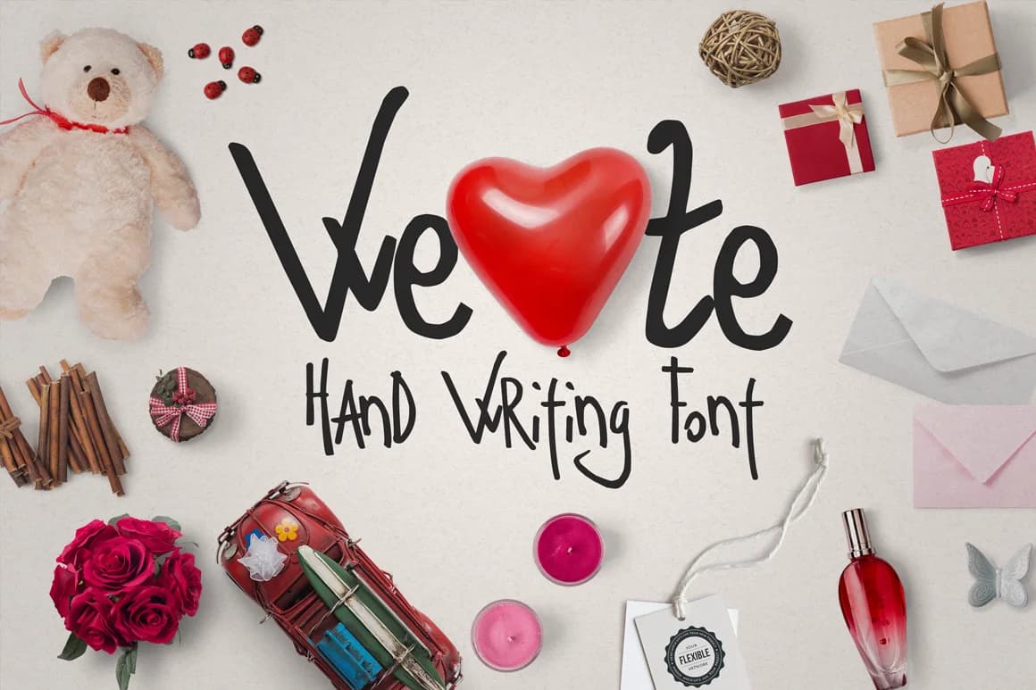
1 / 5About We Font
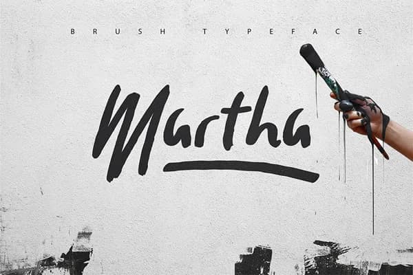
We Font by SmartDesigns is a bold script that combines striking cursive letterforms with the authentic feel of hand-lettered typography. This typeface features confident, expressive strokes that maintain clarity even when displayed at various sizes, making it equally effective for digital and printed applications.
The font works particularly well for creating custom wedding monograms, establishing bold branding across luxury product labels, designing DIY craft signage, and crafting personalized greeting card suites. Designers appreciate how the heavy weight cuts through visual noise while preserving the hand-drawn charm that audiences connect with. Whether you're building identity systems for boutique brands, producing bespoke packaging materials, or developing social media assets, We Font brings character without sacrificing legibility.
The typeface supports multiple language characters and includes a comprehensive glyph set that opens up possibilities for intricate design work. Its bold weight makes it suitable for layering with complementary fonts or standing as a distinctive headline face in mixed typographic compositions. Perfect for those seeking a statement script that reads with impact on everything from vinyl decals to embroidered apparel, We Font delivers personality and strength. Explore We Font on Creative Fabrica and discover how this bold cursive typeface can strengthen your next design.
Style & Use Cases
- Overall Style
- Elegant, Flowing, Ze Font
- Use Case
- Invitations, Branding
- Ideal For
- wedding stationery, greeting cards, and signatures
- Pairs With
- a simple uppercase sans
How to Install We Font Font
Step-by-step instructions for every platform
- 1Download the We Font font file (.ttf or .otf).
- 2Locate the downloaded file in your Downloads folder.
- 3Right-click the font file.
- 4Select "Install" to install for the current user, or "Install for all users" to make it available system-wide.
- 5We Font is now available in Word, Photoshop, Illustrator, and all other apps.
More by SmartDesigns
View all →
Browse fonts by theme
Curated collections →Saw a font in a picture? Identify any font from an image with our free Font Finder.
More Script Handwritten Fonts
Browse all →







What pairs well with We Font?
We Font is a script font that shines as a display or heading face. Pair it with a clean sans-serif or serif font for body text — the contrast creates a clear hierarchy while the two styles stay balanced and easy to read.



We Font
by SmartDesigns
Reviewed by the FontBoxDL team · Updated May 2026