 Firefox
 1 / 8
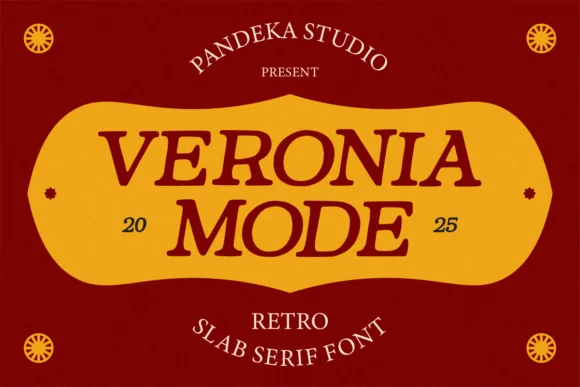
1 / 8About Veronia Mode Font
Veronia Mode hits that sweet spot between mid-century boldness and timeless retro charm. Designed by pandekastudio, this slab serif has the weight and personality to command space on a page. Its thick serifs anchor letterforms with confidence, while the smooth curves keep the overall feel approachable rather than austere.
The font shines on vintage apothecary labels and distillery branding where authenticity matters. You'll see it work just as well on mid-century diner menus, record sleeve titles, and craft beer taproom signage that makes you want to walk inside. This is the font you reach for when you want retro without kitsch, classic without feeling dated. The extended character set supports multiple languages, making it flexible for projects that cross borders. It's the natural choice for boutique packaging suites, editorial spreads that lean into nostalgia, and vintage-forward brand identity work where the type carries real weight.
Pair it with a clean sans-serif for body text to keep your hierarchy clear and your pages breathing. Veronia Mode stands out because it feels like it belongs in 1955 and also in 2025, which is harder to achieve than it sounds. Get it on Creative Fabrica and watch how it transforms your next retro project.
Style & Use Cases
- Overall Style
- Sturdy, Confident, Retro
- Use Case
- Headlines, Merch
- Ideal For
- vintage posters, logos, and product packaging
- Pairs With
- a light sans-serif
How to Install Veronia Mode Font
Step-by-step instructions for every platform
- 1Download the Veronia Mode font file (.ttf or .otf).
- 2Locate the downloaded file in your Downloads folder.
- 3Right-click the font file.
- 4Select "Install" to install for the current user, or "Install for all users" to make it available system-wide.
- 5Veronia Mode is now available in Word, Photoshop, Illustrator, and all other apps.
More by pandekastudio
View all →
Browse fonts by theme
Curated collections →Saw a font in a picture? Identify any font from an image with our free Font Finder.
More Slab Serif Fonts
Browse all →

What pairs well with Veronia Mode Font?
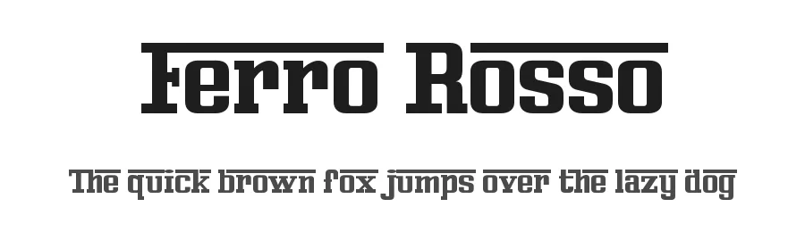
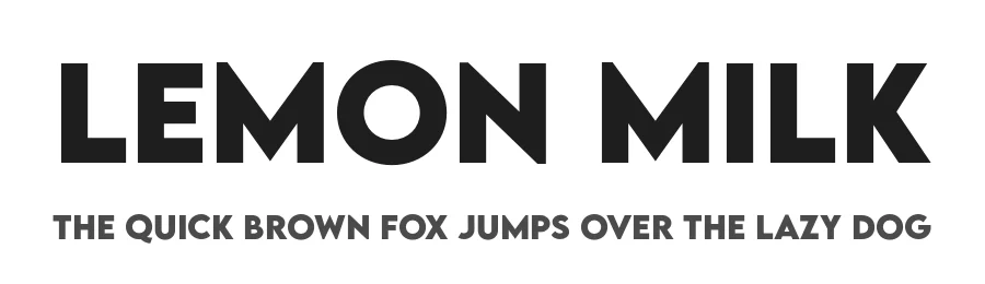
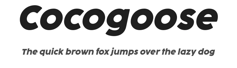
Veronia Mode Font is a slab serif font that shines as a display or heading face. Pair it with a clean sans-serif or serif font for body text — the contrast creates a clear hierarchy while the two styles stay balanced and easy to read.

Veronia Mode Font
Reviewed by the FontBoxDL team · Updated August 2026