 Firefox
 1 / 7
1 / 7About Southlove Script Font
Southlove Script Font by JumboDesign is an elegant calligraphy style built on a dancing baseline that brings movement and sophistication to any project. The thin, delicate strokes give it a refined quality that feels less rigid than typical formal scripts, making it more approachable while still maintaining that undeniable luxury appeal. This is the kind of typeface that draws the eye without screaming for attention, letting the content speak for itself with quiet confidence and grace.
On wedding invitation suites, these flowing letterforms do exactly what you need them to do. They make clients feel the investment in their celebration from the moment they open the envelope. Luxury greeting cards and boutique product packaging are equally natural homes for it, especially when you need a handcrafted aesthetic without the labor of actual hand-lettering involved. You might also consider using it for fine dining restaurant menus, upscale event stationery, personalized thank-you cards, elegant monograms, or Etsy product labels where that handmade touch signals quality and genuine thoughtfulness. The refined curves scale nicely across different sizes, from large poster applications down to small jewelry packaging and anything in between.
Grab it on Creative Fabrica and start adding Southlove to your design collection.
Style & Use Cases
- Overall Style
- Elegant, Flowing, Southlove
- Use Case
- Invitations, Branding
- Ideal For
- wedding stationery, greeting cards, and signatures
- Pairs With
- a simple uppercase sans
How to Install Southlove Script Font Font
Step-by-step instructions for every platform
- 1Download the Southlove Script Font font file (.ttf or .otf).
- 2Locate the downloaded file in your Downloads folder.
- 3Right-click the font file.
- 4Select "Install" to install for the current user, or "Install for all users" to make it available system-wide.
- 5Southlove Script Font is now available in Word, Photoshop, Illustrator, and all other apps.
More by JumboDesign
View all →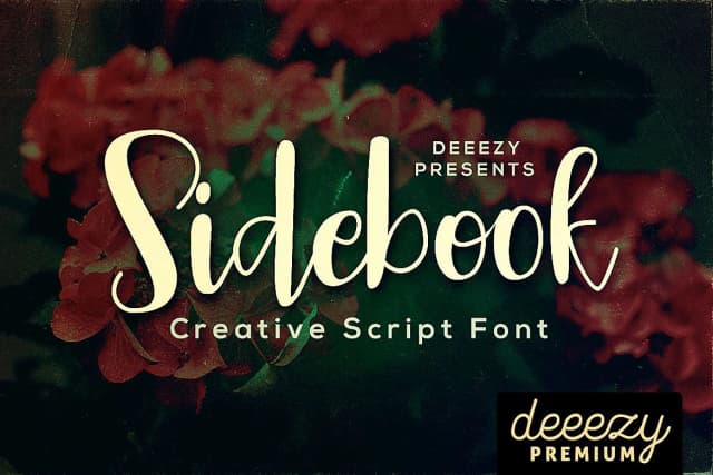

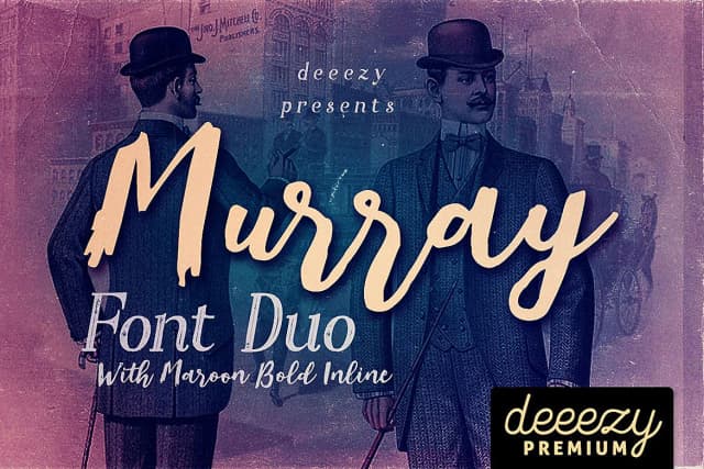
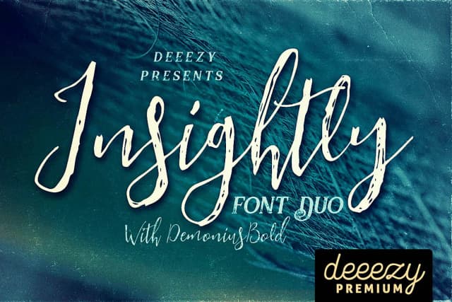
Browse fonts by theme
Curated collections →Saw a font in a picture? Identify any font from an image with our free Font Finder.
More Script Handwritten Fonts
Browse all →







What pairs well with Southlove Script Font?
Southlove Script Font is a script font that shines as a display or heading face. Pair it with a clean sans-serif or serif font for body text — the contrast creates a clear hierarchy while the two styles stay balanced and easy to read.



Southlove Script Font
by JumboDesign
Reviewed by the FontBoxDL team · Updated May 2026