 1 / 9
1 / 9About Sam Font
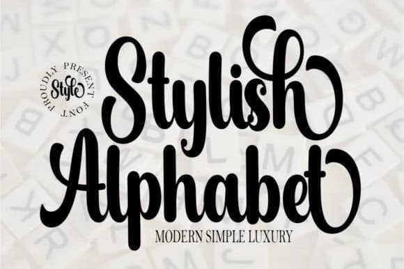
Sam Font, designed by EdricStudio, carries the fluidity and rhythm of handwritten letterforms while maintaining clarity and precision. The script flows with natural curves that feel personal yet refined, making it work across both professional and creative contexts.
Its versatility comes through in dual weights: Sam White offers a lighter, more delicate presence perfect for elegant invitation suites and minimal branding, while Sam Black brings weight and presence to packaging design and bold typography moments. Combining the two weights gives you design flexibility for visual hierarchy and typographic emphasis throughout a project. It works particularly well for wedding stationery, contemporary product labels on artisan goods, luxury skincare and beauty packaging, and hand-lettered signage for upscale retail spaces. The letterforms have enough character to stand out on a crowded Etsy shop shelf, yet remain readable and approachable enough for everyday creative work.
Sam Font suits designers and makers who want personality in their typography without veering into cartoon territory. Small business owners, lettering enthusiasts, and anyone building cohesive brand systems will appreciate how it balances warmth with sophistication and remains practical across applications. Grab it from Creative Fabrica to start integrating this handwritten script into your next branding or design project.
How to Install Sam Font Font
Step-by-step instructions for every platform
- 1Download the Sam Font font file (.ttf or .otf).
- 2Locate the downloaded file in your Downloads folder.
- 3Right-click the font file.
- 4Select "Install" to install for the current user, or "Install for all users" to make it available system-wide.
- 5Sam Font is now available in Word, Photoshop, Illustrator, and all other apps.
More by EdricStudio
View all →


More Script Handwritten Fonts
Browse all →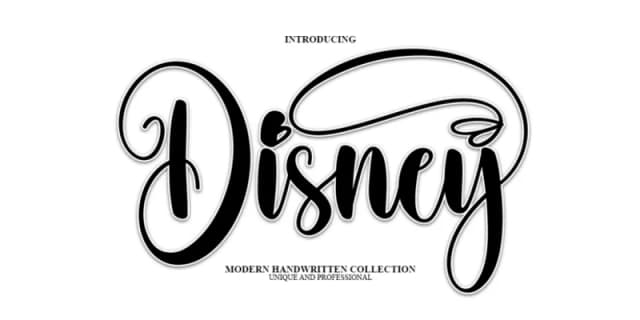
What pairs well with Sam Font?
Sam Font is a script font that shines as a display or heading face. Pair it with a clean sans-serif or serif font for body text — the contrast creates a clear hierarchy while the two styles stay balanced and easy to read.


Sam Font
by EdricStudio
Reviewed by the FontBoxDL team · Updated June 2026