 Firefox
 1 / 7
1 / 7About Prastha Font
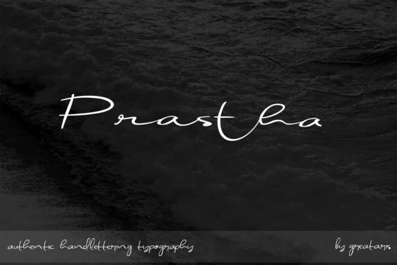
Prastha, designed by Greataris, features flowing letterforms with a genuine handwritten quality that avoids the stiffness many digitized script fonts suffer from. The Thin weight brings out the delicate, refined character of the design, especially when set at larger sizes. What makes this script stand out is how closely it mimics actual penmanship without sacrificing consistency in spacing and letterform shape.
The natural pen-like strokes work beautifully in contexts where that personal, tactile touch is essential to the message. Wedding invitation suites gain elegance and warmth from its flowing quality. Custom wine labels, product packaging for artisanal beauty brands, and hand-lettered greeting cards all benefit from the script's genuine feel. Even when reduced to smaller sizes, the letterforms maintain enough personality and clarity for uses like bylines on design-forward blogs, decorative headers in email campaigns, or signatures embedded in digital graphics. This isn't a font that shouts for attention; instead it whispers with intention and care.
Prastha works best for designers and small business owners seeking personality in typography without veering toward excessive ornamentation. When you need warmth and human touch in your work, this script delivers. Find Prastha on Creative Fabrica, where it's available for download and ready to enhance your next project.
Style & Use Cases
- Overall Style
- Elegant, Flowing, Prastha
- Use Case
- Invitations, Branding
- Ideal For
- wedding stationery, greeting cards, and signatures
- Pairs With
- a simple uppercase sans
How to Install Prastha Font Font
Step-by-step instructions for every platform
- 1Download the Prastha Font font file (.ttf or .otf).
- 2Locate the downloaded file in your Downloads folder.
- 3Right-click the font file.
- 4Select "Install" to install for the current user, or "Install for all users" to make it available system-wide.
- 5Prastha Font is now available in Word, Photoshop, Illustrator, and all other apps.
More by Greataris
View all →
Browse fonts by theme
Curated collections →Saw a font in a picture? Identify any font from an image with our free Font Finder.
More Script Handwritten Fonts
Browse all →
What pairs well with Prastha Font?
Prastha Font is a script font that shines as a display or heading face. Pair it with a clean sans-serif or serif font for body text — the contrast creates a clear hierarchy while the two styles stay balanced and easy to read.


Prastha Font
by Greataris
Reviewed by the FontBoxDL team · Updated May 2026