
 1 / 10
Loading font…
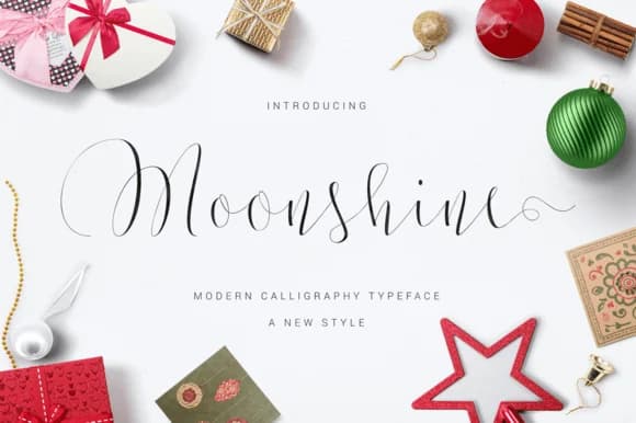
About Moonshine Font
Moonshine Font by Ian Mikraz is a flowing script that captures the organic quality of hand-lettering with contemporary polish. The typeface brings genuine personality to projects where warmth and approachability matter most.
This script font works wonderfully for wedding invitation suites, intimate stationery sets, boutique product labels for artisan goods, and handmade goods branding on platforms like Etsy. The natural letterforms also shine on DIY wooden signs, custom vinyl decal projects, and small-batch food packaging where a personal touch creates brand connection. Labels for homemade crafts, from soap to candles to preserves, benefit from the font's approachable, friendly character that reads as honest and made-with-care.
Moonshine includes extensive glyph support and alternate characters, giving you flexibility to customize your work and ensure consistency across different applications. The font's compatibility with cutting software means you can create precision-cut projects without sacrificing the hand-lettered aesthetic. Whether your next project is a sophisticated wedding suite, a series of boutique labels, or casual craft signage, Moonshine delivers the informal elegance that resonates with handmade and artisanal audiences. Head to Creative Fabrica to add Moonshine Font to your collection.
Style & Use Cases
- Overall Style
- Elegant, Flowing, Moonshine
- Use Case
- Invitations, Branding
- Ideal For
- wedding stationery, greeting cards, and signatures
- Pairs With
- a simple uppercase sans
How to Install Moonshine Font Font
Step-by-step instructions for every platform
- 1Download the Moonshine Font font file (.ttf or .otf).
- 2Locate the downloaded file in your Downloads folder.
- 3Right-click the font file.
- 4Select "Install" to install for the current user, or "Install for all users" to make it available system-wide.
- 5Moonshine Font is now available in Word, Photoshop, Illustrator, and all other apps.
More by Ian Mikraz
View all →
More Script Handwritten Fonts
Browse all →







What pairs well with Moonshine Font?
Moonshine Font is a script font that shines as a display or heading face. Pair it with a clean sans-serif or serif font for body text — the contrast creates a clear hierarchy while the two styles stay balanced and easy to read.



Moonshine Font
by Ian Mikraz
Reviewed by the FontBoxDL team · Updated May 2026