 Firefox
 1 / 8
1 / 8About Landsick Font
Landsick Font by Tour De Force is a flowing handwritten script that brings genuine personality and warmth to creative work across multiple disciplines. With its single-weight construction, this typeface maintains consistent, readable letterforms while preserving an effortless, organic feel that commands attention without overwhelming the overall design. The playful curves and natural rhythm of each letter make it particularly suited for applications where authentic character and emotional resonance matter most.
This script becomes invaluable for wedding invitation suites where couples seek a personal handwritten touch that surpasses traditional calligraphy approaches, event stationery systems designed for milestone celebrations, and greeting card designs that benefit from its approachable yet refined demeanor. Small business owners discover its potential for custom product labels and artisanal goods packaging, while designers and creatives employ it for social media graphics, informal brand headers, and display typography that demands genuine personality.
Whether you're creating baby announcement cards, developing blog headers and body typography, or designing distinctive packaging for handmade or boutique products, Landsick delivers a genuine handwritten quality that feels intentional rather than mass-produced. Discover Landsick Font on Creative Fabrica and integrate this expressive script into your design repertoire.
Style & Use Cases
- Overall Style
- Elegant, Flowing, Landsick
- Use Case
- Invitations, Branding
- Ideal For
- wedding stationery, greeting cards, and signatures
- Pairs With
- a simple uppercase sans
How to Install Landsick Font Font
Step-by-step instructions for every platform
- 1Download the Landsick Font font file (.ttf or .otf).
- 2Locate the downloaded file in your Downloads folder.
- 3Right-click the font file.
- 4Select "Install" to install for the current user, or "Install for all users" to make it available system-wide.
- 5Landsick Font is now available in Word, Photoshop, Illustrator, and all other apps.
More by Tour De Force
View all →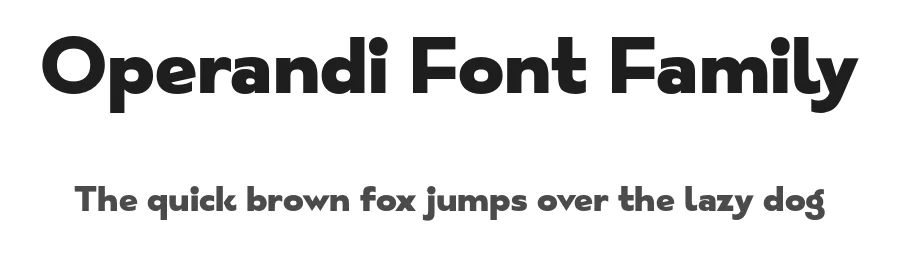
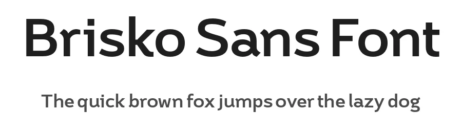
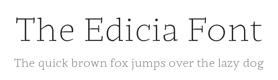
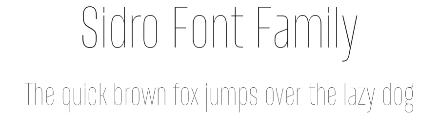
Browse fonts by theme
Curated collections →Saw a font in a picture? Identify any font from an image with our free Font Finder.
More Script Handwritten Fonts
Browse all →
What pairs well with Landsick Font?
Landsick Font is a script font that shines as a display or heading face. Pair it with a clean sans-serif or serif font for body text — the contrast creates a clear hierarchy while the two styles stay balanced and easy to read.

Landsick Font
Reviewed by the FontBoxDL team · Updated May 2026