 Firefox
 1 / 4
1 / 4Loading font…
About Ketikan Font
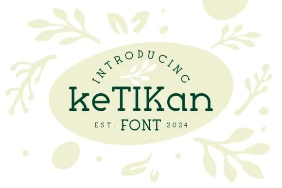
Ketikan, designed by Eko Kurniawan, features chunky slab serifs that give each letterform genuine visual weight on the page. The strokes are bold and geometric, creating a structure that holds up equally well at large display sizes or smaller applications. There's a retro-modern sensibility running through the entire typeface: solid, confident, and built to command attention without unnecessary flourish.
This typeface really shines on product labels and packaging where you need typography that feels substantial and trustworthy. Vintage poster designs benefit from its sturdy letterforms, as do comic book covers and indie music flyers where a nostalgic edge matters. Boutique brands and DIY makers often choose Ketikan when their design calls for something that refuses to fade into the background. The slab serif style connects it to a long lineage of bold display fonts and mid-century signage, though Eko's approach adds enough character to feel contemporary rather than purely nostalgic.
Ketikan works best as a headline or display font, though its readable structure makes short bursts of body text viable too. It's the choice for anyone building retro-forward projects that need type with real substance and personality. Find it on Creative Fabrica.
Style & Use Cases
- Overall Style
- Sturdy, Confident, Typeface
- Use Case
- Headlines, Merch
- Ideal For
- vintage posters, logos, and product packaging
- Pairs With
- a light sans-serif
How to Install Ketikan Font
Step-by-step instructions for every platform
- 1Download the Ketikan font file (.ttf or .otf).
- 2Locate the downloaded file in your Downloads folder.
- 3Right-click the font file.
- 4Select "Install" to install for the current user, or "Install for all users" to make it available system-wide.
- 5Ketikan is now available in Word, Photoshop, Illustrator, and all other apps.
More by Eko Kurniawan
View all →
Browse fonts by theme
Curated collections →Saw a font in a picture? Identify any font from an image with our free Font Finder.
More Slab Serif Fonts
Browse all →
What pairs well with Ketikan Font?
Ketikan Font is a slab serif font that shines as a display or heading face. Pair it with a clean sans-serif or serif font for body text — the contrast creates a clear hierarchy while the two styles stay balanced and easy to read.

Ketikan Font
Reviewed by the FontBoxDL team · Updated October 2026